Showing posts with label kat von d. Show all posts

August 02, 2016

Kat Von D Serpentina Palette - Review, Swatches, Face of the Day

Purchased at Sephora.
Contains an affiliate link.

The Serpentina Palette from Kat Von D is a classic case of "I want to love you."

Kat Von D Serpentina Palette - Review, Swatches

Kat Von D Serpentina Palette - Review, Swatches

Kat Von D Serpentina Palette - Review, Swatches

Kat Von D Serpentina Palette - Review, Swatches
Swatched on clean, un-primed but moisturized skin.

Without a doubt, it's s stunner. Kat Von D's branding is unique and instantly recognizable, and yet it also clearly evokes the theme of Ancient Egypt. If I'm to nitpick anything, it's the bulkiness of the packaging, especially in comparison to her other palettes. I get that it was done to accommodate the pigment jar, but I wish they'd thought of a more elegant solution - especially since that jar also means that the palette is best stored flat, or risk having gold pigment get everywhere.

The shades are stunning, as well - brilliant jewel tones and murky, glittery earth tones. One could quibble about the lack of transition shades, but that's a lazy criticism. Chances are, if you're buying a palette with this kind colour range, you're not the type of beauty junkie with a dearth of browns and taupes and camels in your collections.

They look good. Really, really good. I just wish they were as easy to apply.

Kat Von D Serpentina Palette - Review, Swatches

Kat Von D Serpentina Palette - Review, Swatches

Kat Von D Serpentina Palette - Review, Swatches

Bloodmilk is the one I was most concerned about. I knew going in that vegan eyeshadow formulations could be especially challenged by red tones, but this one hit it out of the park. Over a primer, the colour packs on true to pan, and blends out without a hitch. And it looks GOOD. I always think of red as the kind of shade that best suits blue or green eyes (and an otherwise youthful countenance), but there's something about this particular shade that doesn't make me look a couple of decades too old to be indulging in all-nighters.

Medusa and Ankh have the kind of micro glitter that makes the eyeshadow feel a bit gritty, and difficult to blend out. Medusa is the smoother of the two, with a dirty gold base colour that is just beautiful. I wish they were a satin (or metallic) formulation.

Queen and Hieroglyph, on the other hand, are smooth, creamy, densely pigmented and very easy to work with. Hieroglyph has a slightly flakier texture, but I didn't find it to impact application.

Kat Von D Serpentina Palette - Review, Swatches

Kat Von D Serpentina Palette - Review, Swatches

Kat Von D Serpentina Palette - Review, Swatches

Nile is the biggest disappointment. An incredible rich blue in the pan, it has a dense but crumbly texture when swatched, and applied choppily, with heavy fallout. It's a serious pain to blend out as well.

Scarab has a similar texture and application to Queen and Hieroglyph, and is a stunning colour to boot.

Venom has a texture similar to Bloodmilk, but doesn't build up as well. Like many purples (especially mattes), it tends to look dusty and faded on the lid. As a crease shade, though, it's workable.

Prophet is my second favourite shade from the palette - a rich old gold with a hint of green, that can be used as a glimmer wash all over the lid when applied dry, or as a burnished metallic highlight when applied damp.

Kat Von D Serpentina Palette - Review, Swatches


These are the two looks I was able to create using this palette.

Here I used Nile and Scarab on the lid and lower lash line, with a halo and inner corner highlight courtesy of Prophet. I also used the cooler tones from the Shade + Light Eye Contour Palette for the crease, lash line blending and transition.

Kat Von D Serpentina Palette - Look

For the warmer look, I used Bloodmilk in the crease, Ankh on the lash line, Queen in the outer corner, Hieroglyph through the middle and Prophet in the inner corner, mirrored in the lash line. Again I pulled the warmer tones from Shade + Light for the transition and blending out. 

Kat Von D Serpentina Palette Look

I think the end results are pretty and surprisingly wearable, but the blue look especially was a challenge. For 57$ CAD, I want a palette that's not only beautiful, but a dream to work with - and this is not that.

That said, I'm loath to return it, because, for some reason, it still speaks to me.

And now that I think of it, maybe being gorgeous but demanding is somehow perfectly appropriate for a palette that so strongly evokes the spirit of Elizabeth Taylor's Cleopatra. ;)


January 21, 2016

Kat Von D Shade & Light Eye Contour Palette

Purchased at Sephora.
Affiliate links.

I love seeing women succeed, and Kat Von D has been killing it these last few years. Her brand started out smelling of a vanity project, but she's really made it into a stand-out, with an aesthetic that is both authentic and distinctive.

I'm not much into contouring, so the first iteration of the Shade & Light palette passed me by. I was much more enthralled with the Eye Contour version - even though I already had the Viseart 01, the OG of matte neutral palettes.

Kat Von D Shade & Light Eye Contour Palette

Kat Von D Shade & Light Eye Contour Palette

The packaging strikes a great balance between practical sleekness and gothic whimsy and I very much appreciate the shades being named both on the exterior box and on the back of the palette itself.


Random aside - from some of the pictures Kat has posted on her Instagram, I got the feeling that she was into some version of the occult. Usually the name choices in her brand reference music, art and literature, but this palette is definitely magickal in tone.

(Specifically, some of the shade names are those of demons listed in the Ars Goetia, one of the books in the Lesser Key of Solomon , while others are the names of archangels in Talmudic lore. Very fitting for something named "shade and light", and Kat gets a fistbump for working in references to a freaking 17th century grimoire. )

Kat Von D Shade & Light Eye Contour Palette occult
Three Books of Occult Philosophy by Henry C. Agrippa
The Key to Solomon's Key by Lon Milo DuQuette

The palette itself is laid out in a user-friendly manner, with three functional "quads" - one more neutral, one cooler, one warmer. Each has a larger pan of a light base shade, a medium contour (or transition) colour, a dark defining colour, and a pale highlight colour. 

You can mix and match across the board, but the way the shades are arranged makes the palette very accessible for a makeup newbie trying to build a cohesive eye look. 

They very nicely include a guide on how to do all that:


There's also a very convenient mirror in the lid, something that's sometimes lacking in cardboard-style slimline palettes, and a magnetic closure.

Kat Von D Shade & Light Eye Contour Palette

Kat Von D Shade & Light Eye Contour Palette


The shades are matte, with the three palest having an incredibly subtle satin finish, barely perceptible as a sheen once applied.

Mattes are some of the trickiest formulations to nail. Pigmentation aside, the real secret is getting the texture right. Too soft, and they can blend away too easily, or be hard to layer with other eyeshadows. Too firm, and they can be difficult to lay down and build up.

These strike a near-perfect balance between smooth and dense. I had no issues getting these eyeshadows to do what I wanted them to do. Haze out a soft transition? Easy. Build up a serious smokey eye? No problem. Deepen a crease with perfect accuracy, or soften the edge of a winged eyeliner? Done and done.

If, like me, you were just "meh" about the face contour palette, you might be pleased to know that Lazarus (the grey brown transition colour) is aces for shading out some faux cheekbones.


Laetus - looks more yellow cream in the pan, but actually applies as a bone colour. Probably has the firmest and driest texture in the palette, and one of the sheerer applications. It's great, however, for dusting all over the lid after a primer or cream base to given an even base, especially if you're of a similar colouring to me. If you're deeper, it'll probably be underwhelming.

Samael - a neutral brown mid-tone, a true workhorse shade.

Solas - a deeper version of Samuel, wonderful for sculpting out the crease and the outer corner.

Lucius - a beige-tone off-white, I especially like this for giving a bit of lift to the eyebrow arch without adding shimmer.


Lazarus - a greyed-out, pale brown. Another workhorse shade, which on lighter complexions works beautifully as a face contour.

Saleos - a deeper, cool-toned brown, excellent for sculpting in those shadows. If you have dark hair but have a hard time finding an ashy eyebrow powder, this might work for you as well.

Shax - it's, well...black. Nothing much to say, except that it's very easy to work with. I love it for going over my wing liner to lock it in and keep it matte, and unlike some black eyeshadows, the formula doesn't smudge or drop down debris.

Liberatus - ever so slightly off-white, no chalkiness. I'm pretty "meh" on these kind of colours, so I mostly just wish it was shimmery, but it does what it does.


Ludwin - a hybrid of soft terra-cotta and melon, this is a shade I didn't realize I was missing in my eyeshadow wardrobe. It's perfect for saving a smokey eye that has gone all drab and tired looking, and I like to use it as my softest, most hazed out transition colour to build up an eye look. (When I'm fancy like that.)

Succubus - a muted brick with a bit of burgundy, this shade is especially stunning with blue and green eyes. Like Ludwin, a little of this smudged in the crease perks up a neutral eye look.

Sutry - a deep chocolate brown, a rich and lovely alternative to black.

Latinus - a warm creamy white, this one has the most sheen visible, as well as the richest pigmentation of all the highlighter shades. It's my favourite for that purpose, though it also looks very nice as a base all over the lid, brightening without being stark.

All in all, a very practical and beautiful palette. If Michelangelo was a) alive, b) really into contour, he'd have a field day using this thing to sculpt some faces. If I were to tweak it for my own personal liking, I would have given the highlight shades just a touch more sheen, but YMMV.

April 14, 2015

Kat Von D Innerstellar Palette

Purchased item.

So at this point I pretty much auto-buy anything Kat Von D. There have been some misses, certainly (the mediocre Holiday palette, the underwhelming lipstick re-launch), but more often than not, I dig it. And honestly, KVD herself is growing on me, even though she has had some equally unfortunate missteps (see: her gross affair with Jesse James, the "Celebutard" controversy). She just seems so grounded and actually sweet in her tutorials, and genuinely passionate about her brand. Her instagram is also chock-full of interesting bits about art and literature, which is not at all what I had in my head about her.

ANYWAY.

On to the Interstellar palette (55$ CAD at Sephora).

Kat Von D Innerstellar Palette

Kat Von D Innerstellar Palette

Kat Von D Innerstellar Palette

Pretty, right? I love the groovy packaging design, and I was drawn to the cool-toned, neutral-leaning shades, balanced by a glimmery lilac and vibrant eggplant purple.

Kat Von D Innerstellar Palette

Kat Von D Innerstellar Palette

Performance-wise, most of the shades are spot-on with the quality I've come to generally expect: soft, creamy, not overly dense, but well-pigmented and blendable, lasting a work day over primer without fading. But there are a few exceptions.

The most iffy shades are actually in the first "quad" in the palette. The ice pink being a bit sheer and powdery, so while it's not a shade that I'd apply over a larger area, it works for the tear duct area, and has enough iridescence to add a duochrome flash to a colour layered underneath. The cool taupey/plummy brown is great, an easy satin-finish shade that's perfect for the crease. The shark-grey is maybe a bit sheer as well, but otherwise lovely.

The purple, however, was my biggest disappointment. It has super choppy payoff, and fades out like you wouldn't believe. To get it to show up on the eyelid, I had to use primer AND concealer AND a setting spray to wet the brush, and it still showed up more ashy than it does in this swatch. If you're buying the palette with this shade in mind, don't. There are definitely better options out there.

Kat Von D Innerstellar Palette

But then if you're in it for the cool neutrals, you have some great ones in the middle quad. All of these are beautifully textured. LOOK AT THAT PEWTER. The lilac is gorgeous as well, especially layered over the gray.

Kat Von D Innerstellar Palette

The final quad is good too, with the vanilla satin being the weakest, but for a brow bone shade it's actually just right, as it blends out the transition shade without adding extra frosting. The shimmery taupe is perfect, and the silver is out-of-control pigmented, definitely the richest feeling shade as well. The black is about average, pigmented but a touch choppy, but nothing daunting.

Kat Von D Innerstellar Palette

The purple fail and a couple of quibbles aside, this is a sweet little palette that could fill a hole in your collection if you need cooler tones, especially those mid-toned crease and transition shades (seriously, FOUR taupe/medium brown shades here, albeit all with different textures and finishes).

It's probably not one I'd recommend as a starter palette (not quite enough variation, since everything leans to one side of the spectrum, and heavily favours the medium shade range), nor would I urge the serious makeup aficionado to prioritize it, since they'd probably have these types of colours already. If you're a KVD collector, on the other hand....well, I don't have to convince you, since you probably already do have it.

My personal feeling is that I probably loved it a lot more initially, but that bust up with the purple broke my heart a bit. That said, I do find myself reaching for it quite a bit when I'm looking for that perfect crease colour.

I have a couple of looks here to show you how it applies. The one on the left is a typical cool-toned, work-appropriate, classic eye look, which this palette is perfectly suited to. (I've also rocked out a fantastic grungy, silver smoky eye with it.)

The picture on the right was my attempt to get the purple to show up with some kind of vibrancy (with grey contact lenses for some added contrast). I'm sure someone with more skills could put together a more flattering look, but it doesn't change the fact that's it's a righteous mess to work with, and actually started looking grey and faded within a couple of hours. (No such issues with the rest of the palette.)

Kat Von D Innerstellar Palette

Have you guys tried Interstellar or any of the other KVD palettes? What do you think of her line in general?

(I purchased this item. This post is not sponsored or otherwise compensated.)

October 14, 2013

Kat Von D Spellbinding Eye Shadow Book

I saw the new Kat Von D Spellbinding Eye Shadow Book on Sephora a few weeks ago, and it was an object that inspired such immediate and overwhelming coveting that I was checking out within two minutes. It's a rare makeup item that provokes that kind of reaction from me - especially these days.

Part of it has to do KVD's track record - I have yet to try anything from this brand that isn't good, if not great. Maybe not my particular taste, but I can't fault anything for lack of quality. (I'm sure there have been clunkers - no brand is free of them - but in terms of my experience, it's been really solid.)

The other part....well, I'll admit it, I fell in love with the design. I mean, just look at this external packaging. Isn't it beautiful?

Kat Von D Spellbinding Eye Shadow Book review swatches

Thankfully, the actual palette has the same design repeated. It is a paper-and-cardboard type of palette, so not as sturdy as the rubberized plastic casing of the usual palettes. Ultimately it doesn't matter to me too much because....pretty! *pets palette*

Kat Von D Spellbinding Eye Shadow Book review swatches


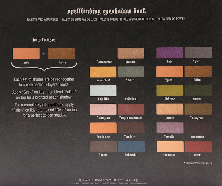
It also comes with a little guide on the back that lists all the shade names, with an asterisk next to the ones that are band new. The others have appeared in other palettes. (If you're avid collector, this might be something to consider, as 11 out of 24 shades are repeats.)

They also suggest a particular application technique that is reminiscent of the Le Métier de Beauté "couches de couleur". Not just pairing the two shades that are placed together, but actually layering them one over the other for different effects.

I will do a separate post showing the layered effects. it was too much to add to this one!

Kat Von D Spellbinding Eye Shadow Book review swatches

The inner top flap also has some suggested applications for different looks, which is a nice use of usually blank space, and more practical than the loose cards that are sometimes included in bigger palettes - and which inevitably get lost.

Kat Von D Spellbinding Eye Shadow Book review swatches

The palette itself is protected by a clear plastic sheet that also lists the names of each shade, as it rests over them. It's nice for keeping the interior surfaces clean. I was actually a little surprised that a palette of this size didn't come with a mirror, but since it's not likely one that I would use outside of a location that would have a mirror available (home or hotel room), it's a negligible point.

Kat Von D Spellbinding Eye Shadow Book review swatches

The range of colours is really excellent, with a mix of neutrals and vivid shades. It is, however, heavily skewed towards the shimmers and glitters, with only two mattes. For that reason I would say it's not an all-around palette, unless you generally abhor using matte shades for your eye looks.

Kat Von D Spellbinding Eye Shadow Book review swatches

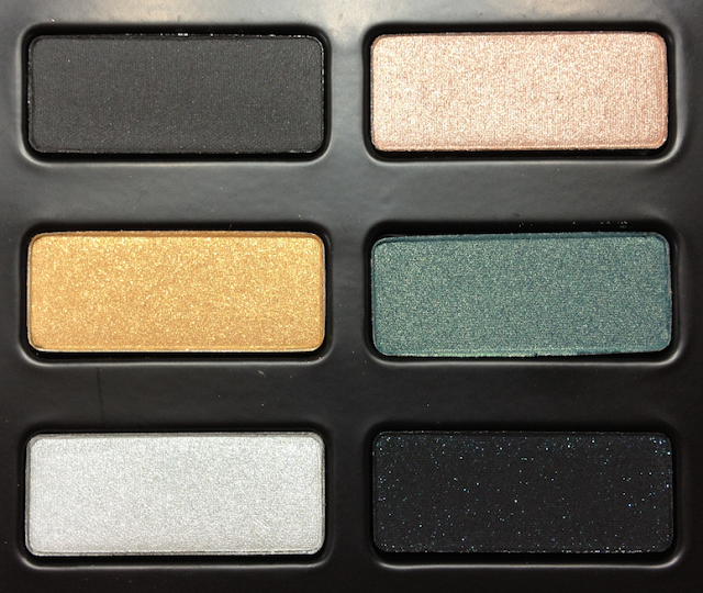
The top left quadrant contains the following:

Dark Throne (new) - satin-finish charcoal black that mostly reads as matte when applies. Soft but dense texture and great pigmentation. Blends, builds and diffuses well, no fallout on application, but can drop down a bit if not worn with a primer.

Precious (repeat) - champagne-pink with a strong shimmer. Soft, creamy texture, and good pigmentation. Blends beautifully, builds up to a point.

Sunset Blvd (repeat) - yellow gold, a mix of shimmer and very fine microglitter (which doesn't really read in the swatch). Generally soft, creamy texture, though you can feel the microglitter. Okay pigmentation when swatched, but did not adhere as well when applied, and had fallout. Does best when layered over another shadow, or cream product.

8 Bit (new) - muted teal shimmer with subtle golden iridescence. Soft, creamy texture. Great pigmentation, easy to blend.

Holy Bible (repeat) - light silver shimmer. Soft texture, very slightly powdery. Good pigmentation, buildable.

Oddfellow (repeat) - matte black with teal microglitter. Drier texture that applies a little more patchy, making it more difficult to blend out. Glitter falls out with blending, best when patted over a sticky primer. (Overall, Oddfellow does MUCH better when blended over Holy Bible, as per the suggested pairing. The combo ends up looking steel blue and quite stunning, and effectively nullifies the powderiness.)

Kat Von D Spellbinding Eye Shadow Book review swatches
Dark Throne and Precious
Sunset Blvd and 8 Bit
Holy Bible and Oddfellow
Kat Von D Spellbinding Eye Shadow Book review swatches

Kat Von D Spellbinding Eye Shadow Book review swatches

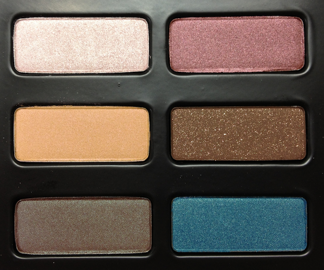
The lower left quadrant contains the following:

Instaglam (new) - silvery-pink shimmer. Soft, very slightly powdery texture, good pigmentation that builds up well.

Stupid Autocorrect (new) - soft burgundy shimmer with subtle pink iridescence. Creamy texture, excellent pigmentation, blends beautifully. (And awesome name.)

Smile Now (new) - pale peach satin with subtle pink duochrome. Soft, slightly powdery texture and sheerer pigmentation that builds to medium.

Cry Later (new) - warm medium brown with a satin finish and bronze microglitter. Soft texture, slightly powdery, with great pigmentation. Blends well. Glitter adheres better than in Oddfellow.

Queen (new) - reddish brown shimmer with teal duochrome (same style as MAC Club and UD Roach). Soft and creamy, with excellent pigmentation and blendability.

Bukowski (repeat) - vibrant turquoise shimmer. Dense, slightly drier texture, which has no effect on the great pigmentation. Applies and blends well.

Kat Von D Spellbinding Eye Shadow Book review swatches
Instaglam and Stupid Autocorrect
Smile Now and Cry Later
Queen and Bukowski
Kat Von D Spellbinding Eye Shadow Book review swatches

Kat Von D Spellbinding Eye Shadow Book review swatches

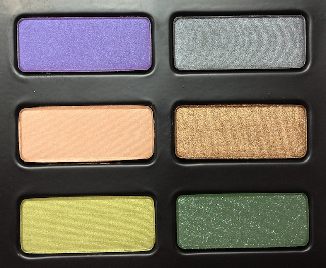
The top right quadrant contains the following:

Babe (repeat) - red-violet satin with a touch of blue shimmer. Slightly drier texture and sheerer pigmentation, buildable to medium. A little stiffer to blend out.

Piaf (new) - gunmetal grey shimmer. Soft, creamy and dense, with excellent pigmentation. Blends easily.

Geek (new) - satin-to-matte pale peach with a beige undertone. Soft and very smooth, with great pigmentation. Blends beautifully, and makes for an excellent base shade.

Fallen (repeat) - intense bronze shimmer. Butter-smooth and intensely pigmented. By far the most pigmented and dense application in the palette.

Birdcage (repeat)  - chartreuse shimmer. Smooth and soft texture, okay pigmentation.  Blends and builds well.

Gunner (repeat) - forest green matte base with green microglitter. Drier texture, with sheer, patchy application, and glitter fallout when applied alone. Best over primer or blended over Birdcage.

Kat Von D Spellbinding Eye Shadow Book review swatches
Babe and Piaf
Geek and Fallen
Birdcage and Gunner
Kat Von D Spellbinding Eye Shadow Book review swatches

Kat Von D Spellbinding Eye Shadow Book review swatches

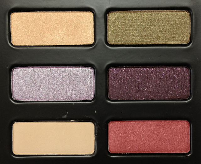
The lower right quadrant contains the following:

Galore (repeat) - golden-champagne shimmer. Soft and creamy texture, with good pigmentation. Applies and blends smoothly.

Hexagram (new) - olive shimmer with faint copper duochrome. Soft and creamy, great pigmentation. Blends very well. This is a beautiful shade, a more subtle variation on the Queen/Club/Roach duochrome.

Arcadia (new) - silvery-lilac shimmer. Very soft and creamy, with great pigmentation and a bit of fallout upon application because of that softness. Very easy to blend, sheers out almost too easily.

Wonderland (repeat) - matte eggplant purple with dark pink micro glitter. Drier texture, though ok pigmentation and doesn't apply patchy. Glitter falls out a bit, and blending is a little stiff, but not problematic.

Countess (new) - matte warm beige. Very smooth, fine texture, a touch dry. Sheer to medium pigmentation. Blends easily. On me, this is the perfect nude shade to use on the brow, or as a base on the eyelid for a natural look.

WTF (repeat) - rust red shimmer. Slightly dry, soft texture. Ok pigmentation, but buildable. Blends well, not patchy.

Kat Von D Spellbinding Eye Shadow Book review swatches
Galore and Hexagram
Arcadia and Wonderland
Countess and WTF


Kat Von D Spellbinding Eye Shadow Book review swatches


Availability: Exclusive to Sephora and www.sephora.com. Price is 66$ CAD and 55$ USD.

Pros: Gorgeous packaging, beautiful shade range, generally blendable textures and good to intense pigmentation for the shimmers and satin/mattes. Excellent value. The suggested blending pairs are usually quite gorgeous. (Separate post coming to show those combinations.)

Cons: The matte+microglitter shades have spotty application - sheer, fallout, patchy blending. Lack of matte shades decreases versatility. Nearly half of the shades are repeats.

(I purchased this item. Post is not sponsored or compensated. Opinions are my own.)