Showing posts with label estée lauder. Show all posts

June 03, 2013

Estée Lauder Bronze Goddess Summer 2013 - Batik Sun Palette

With the seasons seemingly being a hit-and-miss affair this year, I'm pulling out every summer-themed makeup item in an attempt to invoke some kind of sympathetic magic. Luckily, there is an array to choose from, so though it may not feel like summer, it will darn well LOOK like summer.

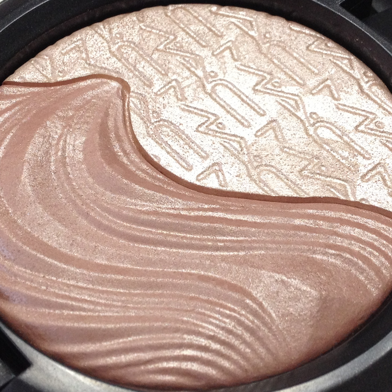
The Estée Lauder Bronze Goddess collection offers up the usual suspects this year, with bronzers and burnished tones galore. And as usual, I gravitated to the golds and teals of the gorgeous limited edition Batik Sun palette.

Estée Lauder Bronze Goddess Summer 2013 - Batik Sun Palette

Estée Lauder Bronze Goddess Summer 2013 - Batik Sun Palette

In many ways this doesn't come across as a particularly unique palette. If you have the Estée Lauder Bronze Goddess palette from a couple of years ago, Bronze Sands from last year, or the Stila Sun palette from waaaayyy back when, you're probably in the ballpark of the kind of look that can be achieved with this. That said, there are some real standout shades here as well.

The pale wheat in the bottom left corner is a fairly common shade - medium pigmentation, soft and blendable. Not unique, but almost mandatory it seems.

The light, pumpkin orange is delightfully unexpected, and would looks absolutely killer with blue eyes. It has great pigmentation, a smooth texture and a satin/shimmer finish.

The gold shade is, again, standard, but boasts an incredibly buttery texture and fabulous pigmentation. It applies like a dream.

The Mediterranean teal shade is jaw-droppingly gorgeous. It has a slightly drier texture, albeit not powdery. It takes more patting and layering to build to full intensity, and doesn't blend as smoothly, but for THAT COLOUR, I will make the extra effort.

The purple-tinged taupe (turple? paupe?) in the middle has the same dense, creamy, faultless texture as the gold, with similarly intense payoff. Stunning in the crease and as a liner.

Estée Lauder Bronze Goddess Summer 2013 - Batik Sun Palette

Though this is not one of the gélée-texture palettes that I am so inordinately fond of, it's still a very strong outing from Estée Lauder on the eyeshadow front.

Availability: Still at some counters, and from The Bay online. Also at Nordstrom and Neiman Marcus. Price is 50$ CAD and 48$ USD.

Pros: Textures range from good to excellent, with lovely payoff across the board. The orange and teal shades in particular are more unique. Range for creating a more subtle versus very vibrant eye look.

Cons: The teal shade requires a bit more care in applying and blending. The neutral shades are more easily duped, so depending on your collection this palette may not be cost-effective.

(I purchased this from the EL counter at The Bay.)

April 16, 2013

MAC Extra Dimension Skinfinishes - Definitely Defined and Shape the Future

If you've been reading this blog for a while, then you know what a fan I am of the gélée tribrid texture that both Estée Lauder and Mac have starting featuring in the last couple of years. (If you're new to this blog - welcome! -  and feel free to take a gander at my previous reviews featuring these types of products here.) So of course I had to snatch up the more interesting looking items from the MAC Extra Dimension collection as soon as it was available to order. And seeing as how disappointed I've been with some previous MAC collections, you have to know that ordering sight-unseen indicates a lot of faith that these would be awesome.

These are two of the three Skinfinishes available in this collection. (The third is more golden bronze, and I already have a few highlighters in that family, and for once I exercised restraint.)

MAC Extra Dimension Skinfinishes - Definitely Defined and Shape the Future
Right to left: Definitely Defined, Shape the Future

MAC Extra Dimension Skinfinishes - Definitely Defined MAC Extra Dimension Skinfinishes -  Shape the Future


These are definitely beautiful to look at, and I love that MAC has expanded upon the aesthetic that they introduced with the last Extra Dimension collection in a way that makes the duo colour feature both functional and pleasing to the eye. The wear time is good one both of these, about 8 hours or so, and they are highly pigmented, with that peculiar dry-soft texture that applies smoothly and blends or buffs out beautifully. If you are inclined to wear these wet (perhaps for an eye look), the metallic or frost finish is amplified, as well as opacity.

The finish varies somewhat between the two parts of each Skinfinish. Definitely Defined two parts have a more similar finish across the board. The flat portion is a highly metallic silver-pink white that has to be used judiciously as a complexion product, as it emphasizes skin texture dramatically. I personally prefer to use it as an inner eye corner highlight, rather than on my cheekbones, unless I'm going for a particular look. The raised portion is a pale pink that is less metallic, and works a little more easily as a highlighter. Both of them can be applied very lightly with a small fluffy brush for a more discreet effect - but discreet is relative. This is distinct shimmer, not a micro-sheen. Absolutely beautiful, regardless.

Swatches below are in natural light and in the sun.

MAC Extra Dimension Skinfinishes - Definitely Defined


Shape The Future has an equally shimmery flat portion, a pale peachy pink that is very similar in effect to the raised portion of Definitely Definied. The raised portion is less shimmery, and applied to the skin, it actually reads a lot more satiny. It is also pigmented like CRAZY. This is a shade that is bound to look stunning on deeper, warmer skin tones. If you are paler, use a light hand and a fluffy brush to buff it in, unless you prefer a bolder look. The colour can be a little harder to pull off if you have pinkier undertones, a brick shade that can look like sunburned skin.

MAC Extra Dimension Skinfinishes - Shape the Future


I have to say that all of the shades are unique in my collection, especially when combined with both the pigmentation level and the finish.  I pulled a few other gélée-textured highlighters, as well as a couple of MAC MSFs, to see if there was anything comparable.

MAC Definitely Defined,MAC  Suberb, Estée Lauder Shimmering Sands, MAC Redhead MSF, MAC Stereo Rose MSF, MAC Shape the Future
Clockwise from top left corner: MAC Definitely Defined,MAC  Suberb, Estée Lauder Shimmering Sands, MAC Redhead MSF, MAC Stereo Rose MSF, MAC Shape the Future.

MAC Definitely Defined,MAC  Suberb, Estée Lauder Shimmering Sands
Left to right: Superb, Definitely Defined (flat and raised), Shimmering Sands.

 MAC Redhead MSF, MAC Stereo Rose MSF, MAC Shape the Future
Left to right: Shape the Future (flat and raised), Redhead MSF, Stereo Rose MSF.

Shimmering Sands and Superb are actually both closer to each other than anything else here. Both Redhead and Stereo Rose are somewhat similar to a mix of the two sides of Shape the Future, but neither of them blend as smoothly or last as long.

Availability: Currently on the MAC website, as well as in stores. They are selling quickly, however. Price is 35$ CAD.

Pros: Intense pigmentation, smooth, very blendable and variable texture. Unique shades, depending on your collection. Shape the Future is excellent for warm to deep tones, both as a highlight and blush.

Cons: High frost/metallic finish may limit application, as it will emphasize skin texture.

(I purchased these items from MAC.)

January 19, 2013

Blush Comparison: Tarte Achiote, Estée Lauder Wild Sunset, Nars Amour, Korres Peach, MAC Merrily

As I mentioned in my Resolutions post, I'd like to expand on the review format I've become comfortable with over this past year. Inspired by Blooming Beauty's fantastic dupe/comparison swatches, I'm going to try to do more of those to go along with the reviews. Part of it is to be helpful to you guys (hopefully!) and the other part ties in with my other resolution, to keep myself more accountable to my budget. I feel like I probably have many (MANY) similar shades in my collection, and doing comparison swatches will possibly shame me into buying less redundant items.

Or possibly I will just pull a Pisces and get distracted by all the pretty colours and it will accomplish absolutely nothing whatsoever. Eh. Worth a try, right? 

Let's start with yesterday's Tarte Achiote Blush. I pulled out the shades from my collection that looked like they might be the closest, including two relatively new ones that will have forthcoming reviews. It was actually a little harder than anticipated to find good matches, since most of the coral blushes I own are lighter in tone.

Clockwise from top left: Tarte Achiote, Estée Lauder Wild Sunset, Korres Peach, MAC Merrily, Nars Amour


Left to right:MAC Merrily, Nars Amour, Tarte Achiote, Estée Lauder Wild Sunset, Korres Peach.
Indirect natural light.

Left to right:MAC Merrily, Nars Amour, Tarte Achiote, Estée Lauder Wild Sunset, Korres Peach.
Direct sunlight.

The closest match is probably the Nars Amour, which is just a touch deeper and leans ever so slightly to a muted rose. The finish is about equally matte, though the texture is less finely-milled.

The second closest is the Estée Lauder Wild Sunset, which is basically the same base colour, but with a slight golden shimmer, more visible in the sunlit swatch. It also has a softer, creamier texture.

MAC's Merrily (discontinued) is darker and more red-based, with golden shimmer. It is equally, if not more, pigmented, with that soft but dry texture characteristic of mineralized blushes.

Korres Peach looks similar enough in the pan, but it is applies with a lighter, pinker hue and a much stronger shimmer. The texture is very creamy, soft and densely packed.

So it looks like there are a couple of similar options if for some reason you have a hard time acquiring Achiote blush, though none of them have a really comparable texture or wear.

I hope this sort of post is helpful - let me know if you'd like more!

(All items were purchased by me.)

December 12, 2012

Estée Lauder Violet Underground Palette

Like the Lise Watier Millésime "Les Vins" palette I reviewed a little while back, the Violet Underground palette from Estée Lauder was a stunning fall piece that has segued seamless into the holiday season. It is probably my favorite from the Fall 2012 collections, not least of all because of its seasonal versatility.

It is absolutely gorgeous, and performs flawlessly.


Estée Lauder Violet Underground Palette

Estée Lauder Violet Underground Palette


I love that EL veered slightly from the usual gold packaging and went with the midnight exterior. The shades in the palette are so intense, gold would have pushed this uncomfortably close to the tacky side of the 80s, rather than the Jerry Hall, glam-tastic fabulousness that this palette totally owns.

The colors are so rich, vibrant and metallic in the pan, and they do not disappoint when applied.

Estée Lauder Violet Underground Palette

Estée Lauder Violet Underground Palette swatches
Natural and artificial light.
Estée Lauder Violet Underground Palette swatches
Direct sunlight.

The formula is the Cyber Eyes tribrid that can be used wet or dry, and while the colors do go on more metallic and intense when used wet, I had no problem getting density and payoff when using these dry, and they last all day. It's even better than the Bronze Sands palette, and that's saying a lot.

Despite the scary fuchsia, this is a surprisingly versatile palette. The soft black and beautiful navy shade will, of course, make for a classic smoky eye, while the brown and cream shades work just as well for a more subdued daytime combination. There are no matte shades, so it's not an all-arounder that you can toss into your weekend bag, but it has a lot more range than would be immediately obvious.

Availaibility: Harder to locate now, but it is still available on the US Estée Lauder website, and my local Bay still had it in stock this week. Price is 48$ USD and 50$ CAD.

Pros: Sublime formula with great density and pigmentation. Fantastic overall aesthetic. Surprisingly wearable and versatile.

Cons: None that I can think of.

(I purchased this from Lord and Taylor in the States.)

August 01, 2012

Estée Lauder Pure Color Blush - Pink Kiss

So, Tom Pecheux is genius. I'm not even kidding. He has reinvented the EL brand without bastardizing it, staying true to its classic structure. If you haven't passed by the Estée counter recently, do yourself a favor and take a look at the new Violet Underground Fall collection. If that is not one of the most awesome collections out this season, then I am a monkey's uncle. I will have some reviews up for that collection as soon as I can purchase it, but in the meantime, let's chat about something from the new and improved permanent range - the Pure Color Blush.

These blushes are substantial in size and come packaged in the redesigned compact. There's something terrifically modern and luxe about the generous, squared off shape. While they are not as dense and buttery as the Tom Ford blushes, they have a similar appeal and a friendlier impact on your wallet.


Pink Kiss is one of the more natural shades in the range, a soft, neutral toned pink that should suit a lot of skin tones in the light-to-medium range. I feel like it's one of those pink that can pull a bit cool or warm depending on your coloring and the light.

It has what Estée Lauder considers a 'satin' finish. The underlying color is satin, but it does have very fine micro-glitter layered in there as well, which can be seen in the swatches below. Not as obnoxious as some of the Nars blushes, and it mostly buffs out when blended, but be aware that it is there and can be a little more obvious under bright lights. The overall effect is slightly sheeny, and flattering.

The texture is interesting - not particularly buttery, but fairly dense, it applies beautifully. It blends right in without building up any texture on the skin. The pigmentation is ideal for me - enough to show up easily but not so strong that you have to be super careful in your application.

Indirect natural light.

Direct sunlight.

Blended out over larger surface, indirect light.

Availability: Nordstrom, Neiman Marcus, Bergdorf Goodman, as well as The Bay and the Estée Lauder website. Price is 32$ CAD (28$ USD).

Pros: Easily wearable pigmentation level. Lovely sheen, blends beautifully. Great everyday color for light to medium skin tones.

Cons: Micro-glitter may remain visible in some lights, making the perfect office shade problematic for some.

(I purchased this item at the EL counter at The Bay.)

July 18, 2012

Aerin Lauder Makeup Collections

Did you know Aerin Lauder was coming out with her own range of products - decor, lifestyle and cosmetics? Yeah, neither did I, until yesterday. Judging from the preview pictures online, it looks like a beautifully edited, strongly branded line. Classic, elegant, modern. Link to the preview page on the EL website is here, but if you're viewing from Canada you need to change your viewing country to United States or you won't be able to see it properly.

It looks like she is starting out with an Essentials collection that will grow slowly as more products are added to the lineup. The brushes look cute, but I'm more excited by the actual makeup items. There will also be a Fall collection, consisting of three items appropriate for the week, and three for the weekend - roughly cooler vs warmer shades. Honestly, I don't see the point of splitting the kind of makeup colors you wear that way, but they are lovely mini collections.

Fall Color Weekday
(picture from www.esteelauder.com)

Fall Color Weekend
(picture from www.esteelauder.com)

So what do you guys think? Will you be checking these out?

June 25, 2012

Estée Lauder Bronze Goddess Capri Summer 2012 - Bronze Sands Pure Color Cyber Metallic Palette

With the Fall collection from Estée Lauder looming on the horizon (preview pics at Smartologie), I feel extra bad that I slacked on getting this post up earlier. You know, when it was still available to purchase. This palette is pretty much sold out everywhere, but if you do come across it in a retail location, JUMP ON IT. It is a) beautiful, b) fetching extortionist prices on ebay and amazon, and c) the perfect palette to complement this fantastic summer weather. I debated whether to even put this review up, but I figured the high collectible status might merit some extra swatches circulating out there in the wilds of the web.

So, without further ado, the Bronze Sands palette from the Estée Lauder Bronze Goddess Capri Collection for Summer 2012:

Estée Lauder Bronze Goddess Capri Summer 2012 Bronze Sands Pure Color Cyber Metallic Palette

Estée Lauder Bronze Goddess Capri Summer 2012 Bronze Sands Pure Color Cyber Metallic Palette


Yeah. It's pretty damn gorgeous. I wasn't sure if I loved the rippled sand effect when I saw the pictures online, but in person, it works.

The texture and finish is exactly the same as that of the Cyber eyeshadow singles I've reviewed before - that tribrid finish that can be used wet or dry. The cream is the sheerest of the five when used dry, the brown the richest. All of the shades become more opaque and more metallic when used wet. They all do best applied over a primer to prevent fading, and I would add that you need to be careful when blending. The texture is so incredibly silky that they can easily blend into a muddy mess if you're overly vigorous.

But...is this a palette that is worth hunting down, or paying exorbitant prices for on ebay?

For the quality and aesthetic appeal, it might be. However, if you have been keeping on top of the recent releases from EL, then chances are you probably already own a couple of these shades in a different format.


The cream, brown and gold shades are the three that don't have any dupes in the past or current line-up of Cyber shadows. The brown is very similar to Cyber Copper, but richer and warmer in tone.


If you already own Topaz Chameleon and Cyber Teal, then you will find these shades to be a repeat.

What I love about the finish on these is how strongly metallic they read, regardless of the light. In the swatches below you can see differences, but that strong gleam and shimmer shows up even in murky indoors lighting. In soft, incandescent light, they are STUNNING.

In indirect natural light.

Indirect natural light, different angle.

Estée Lauder Bronze Goddess Capri Summer 2012 Bronze Sands Pure Color Cyber Metallic Palette
Full sunlight.
Artificial light.
I can't do my usual review breakdown, as this is not an item that is currently available. I will say that I do love the tribrid finish, and find this palette to be perfect for this time of year, when a higher level of gleam works beautifully with tanned, dewy skin. It's not strictly speaking a versatile palette, since the finish on all the shades is identical, but it's one that rounds out a collection nicely.

June 13, 2012

Estée Lauder Mad Men Collection

Be still my heart.

I am going to be upfront with y'all that I cannot be objective about this collection. I'm a nut for vintage styling, and I freakin' LOVE Mad Men - the simultaneously sympathetic and loathsome characters, the exquisite period detailing, the precise balance of pathos and humor, and, of course, the pure masculine glory that is Don Draper.

When Estée Lauder came out with this collection, it was love at first sight. The packaging is just sublime, and I am going to conserve the boxes to store along with the actual product.

Estée Lauder Mad Men Collection

Estée Lauder Mad Men Collection

They really outdid themselves with the period-authentic details, while keeping the overall feel fresh and modern. The outer packaging has that mix of pale blue/aqua and gold that calls to mind Palm Springs or Palm Beach, circa 1962, without being too precious.

The Creme Rouge in Evening Rose is a gorgeous, heavy and very, very blingy, with a blue stone on the push-clasp. The kind of thing that inspires any excuse to use in public.

Estée Lauder Mad Men Collection
Mad Men Limited Edition Creme Rouge in Evening Rose

The lipstick in Cherry is a smaller size, which for the price might seem outrageous, but it is accurate for the period.

Estée Lauder Mad Men Collection lipstick cherry
Mad Men Limited Edition Lipstick in Cherry

Estée Lauder Mad Men Collection lipstick cherry
Size comparison: Cherry below,
a standard GWP-packaged Estée Lauder lipstick above.

Both items are actually a lot less red than I was expecting, with the lipstick being a very clear red with a strong pink undertone, almost rasberry-ish, while the Creme Rouge is beautiful bright rose. I think very warm complexions might have a hard time pulling these off, but they are worth a try if a counter near you has any testers.

With my coloring (light skin, dark eyes, brownish-blond hair), they're pretty damn perfect. The kind of makeup that looks crisp, clean and pretty with just a touch of mascara.

Estée Lauder Mad Men Collection


The lipstick is an opaque, satin finish cream that applies with a lot of pigmentation on the first swipe. It doesn't have any detectable shimmer, but retains a certain glossiness. I wouldn't call it hydrating, but it is very comfortable on the lips, and wears very well. Like all reds, it stains and therefore lasts longer than the average - up to lunch with no problem. And then you can just whip out the Creme Rouge compact to reapply, and be wonderfully chic about it. ;)

The Creme Rouge is not the usual cream-to-powder concoction. Evoking its ancestry, this rouge is wonderfully creamy and dewy, and retains a soft glow even after it's worked into the skin. It also has a very fine shimmer that is barely apparent, but there. If you are concerned about aggravating the look of oily skin, or just don't enjoy a glowier finish, then this is probably not going to rock you boat. I do think it can be a very beautiful, fresh and vibrant look though, and in the summer, over tanned skin - I think it's just stunning.

It can be applied as is from the pan with the fingers, and blended in for a more dense application. However, I do prefer doing a more sheered out version using the Real Techniques contour brush (probably my favorite brush for cream blushes).

And it can also be used as a lip product. With the creamier finish, it actually feels very nice on the lips, and dries to a satin finish. (Actually, I think it might be a very similar formulation to the one featured in the MAC Casual Colour Collection.)

Estée Lauder Mad Men Collection swatchesEstée Lauder Mad Men Collection swatches

In each picture: Creme Rouge on the left, Lipstick on the right. Indirect natural light for both, at different angles.

Estée Lauder Mad Men Collection swatches

Picture on the left is under artificial light, the one on the right is in full sunlight.

Estée Lauder Mad Men Collection swatchesEstée Lauder Mad Men Collection swatches

The Creme Rouge blended out, in indirect natural light on the left, full sunlight on the right. 
You can see more of the shimmer in the sunlit picture.

Availability: Available on the Bloomingdale's site, on the Estée Lauder site, and perhaps at some counters. Unfortunately it's not available in Canada, however the US site will ship to here. The lipstick is 25$ USD, the Creme Rouge is 40$ USD.

Pros: Incredible vintage packaging. Beautiful colors that are both period-appropriate and modern-use friendly. Creamy, blendable and pigmented textures on both items. The Mad Men tie-in, if that's your thing. 

Cons: Difficult to locate and acquire, small size of the lipstick is incongruous with the price. May be difficult for warmer complexions to carry off.

(I purchased both these items from the Estée Lauder website.)