February 28, 2012

Physicians Formula Happy Booster Glow & Mood Boosting Blush

Ok, brands really need to start using simpler product names. Or acronyms. Physicians Formula Happy Booster Glow & Mood Boosting Blush (in Rose) is a fine product, but good grief is it ever a pain to type out.

ANYWAY.

I'm not usually a sap, but I did buy this because the little hearts design was just way too appealing to pass up around Valentine's Day. It's very similar to the Stila Make Me Blush from last year.


The Happy Booster blush is actually marginally more expensive than the Stila blush was (15.99$ compared to 14$) but it is far more accessible, and it's not too difficult to score one on sale. I prefer the lack of gilded overspray as well, as I loathe having to scrape away a layer of gold just to use a product.


I like that it includes a mirror underneath the flip-pan, but the brush is completely useless and the space allocated for it makes the packaging unnecessarily bulky. 

But enough about looks - how does it perform?

Artificial light.
Individual hearts swatched.

Indirect natural light.

Indirect natural light.
Applied and blended with natural-hair brush.
The blush is a mix of rose, plum and pink tones, with an overall satin finish and light pigmentation. As the name suggest, this does indeed give a glowy sort of effect - a light, natural flush.

It applies sheerly, and the smooth, silky finish means that there is no perceptible texture on the skin. It's great if you are blush-phobic, a challenge if you prefer a stronger cheek look. Though the texture means that it can be built up without fear of looking like you mashed your cheeks into some pink powder, it does take some layering to get a more defined effect.

I found that the key to achieving more depth with this was to use a flat-top synthetic brush. Otherwise, the swatch above is representative of what you would get with a regular, natural-hair blush brush. (EDIT: If you prefer natural hair brushes, the best application was with my MAC 134.)

I do like this, and a chunk of that is probably due to the cuteness factor. I tend to prefer blushes that go on a little stronger, but if you like a lighter look or would rather build up than blend out, then this is a nice item to consider.

Availability: Most drugstores that carry Physicians Formula, about 15.99$ CAD.

Pros: Very natural look, light texture, adorable aesthetics.

Cons: Bulky packaging, tricky to build up to desired intensity, price is a trifle high for a drugstore brand.

(I purchased this item from Pharmaprix/SDM.)

February 24, 2012

All-Season Bronzers - Physician's Formula vs Guerlain

I've wanted to try Guerlain's Terracotta 4 Seasons Tailor-Made Bronzing Powder for a while.

Picture courtesy of www.beautylish.com

And now apparently Physicians Formula has duped the concept, if probably not the actual product, with Bronze Booster Glow-Boosting Season-to-Season Bronzer.*

Picture courtesy of www.physiciansformula.com

Hmmm. High-end or drugstore - which way to go? (I usually tend to go with the original innovator, but I actually like the design of PF version, and the shades themselves look more up my alley, at least for potential contouring.)

*I can't be the only one getting tired of the absurdly long product names, right?

February 23, 2012

Dior 5 Couleurs Eyeshadow Palette - Couture Golds

I'm still procrastinating on the Dior Spring palettes - too pretty, can't bring myself to use them yet. This week! I will do it this week, I swear.

In the meantime, I bring you Couture Golds, from the Dior Holiday collection. (It was rather delayed here in Canada, so I only picked it up toward the end of December.)


I enjoy Dior packaging. It always feels nicely hefty, classic and subtle, with that discreet "CD" logo.


Despite the name, this palette is not so gold-toned as to be unwearable by someone with a cooler complexion. The only shade that actually really stands out as warm is the one in the top-right corner, which is a peachy gold. The others are a basic but well done cream pearl, a shimmery beige, an expresso brown with gold micro-glitter, and a pale gold glitter.

Indirect natural light.
Swatched clockwise starting at top-left corner,
middle pan swatched at far right.

Indirect natural light, different angle.

Artificial light.

This palette is sort of a mixed bag, though overall I like it.

The cream, gold and beige shades all have a very similar finish, classic Dior - silky-smooth, creamy, fine-textured, and apply with good color pay-off.

The brown is an odd duck, though similar to the way a lot of mattes scattershot with glitter tend to apply. The texture is drier than I'm used to from Dior, slightly patchy and does take some layering to build up color. The micro-glitter actually doesn't fall out noticeably, though it does disappear when you apply and blend. To increase the intensity of the color, and to keep some of the sparkle, it really needs to be patted on over a tacky base. Not just a primer, but something with some creaminess, like the Lise Watier Eye Shine pencils.

The super glittery middle pan is kind of awesome. It's...creamy? Not gritty at all. It applies sheerly, but this is not something I would pack on. I believe it's meant to be dabbed lightly over whatever shadow you've applied in order to give this amazing sparkle that looks almost wet, and reflects like mad. It reminds me a bit of the Stila Jewel Eyeshadows. Not a look I would embrace for everyday purposes, but it's fantastic for adding some oomph to an evening look.

This palette holds up as well as Dior eyeshadows generally do on me, meaning they will last through a work day, over primer, with no problems.

Availability: Difficult to find now, since it was a Holiday LE item, but it is still available on the Nordstrom site. Price is 59$ USD, and was 60$ CAD.

Pros: Gold palette that is still wearable with cooler complexions, great texture for three of the shades, glitter shade can transform your look from day to night.

Cons: Brown shade has some pigmentation/application issues, the emphasis on shimmer and glitter means that this palette is not a stand-alone item, unless you prefer a glitzy eye look.

February 21, 2012

Estée Lauder Mad Men Collection!!

You'll have to forgive the ear-splitting shriek I just emitted, but I cannot believe how completely AWESOME this is:

Creme Rouge in Evening Rose, Lipstick in Cherry
Picture courtesy of www.esteelauder.com
A Mad Men collection from Estée Lauder, in authentic 1960s style vintage packaging.

I am hyperventilating from the synergy.

Picture courtesy of www.esteelauder.com

Also, the Pure Color Blushes, including two shades to flank the Mad Men collection:

Lover's Blush
Picture courtesy of www.esteelauder.com
Wild Sunset
Picture courtesy of www.esteelauder.com

Both the collection and the blushes are available for pre-order on the EL website. And you know I'll be calling my SA first thing tomorrow morning.

February 20, 2012

Quickie - MAC Solar Plum Lipstick

I'm sort of on a no-buy for the next two months. Maybe a low-buy. A very, very casual low-buy, which means that I'm not actively hunting down new things, but should I come across something awesome, I'm not forcing myself to pass it up.

So basically the way every non-makeup-obsessed person goes about their business.

ANYWAY. Since I'm curbing my spending, I decided to dig into my stash and rediscover some old favorites. Today it's Solar Plum lipstick from the MAC Summer 2007 Moonbathe collection.


Can I first just say that I wish MAC would do this sort of packaging again? It's so darn pretty.

Solar Plum is indeed plum, albeit with reddish brown undertones and a subtle gold pearl. It's a frost finish, so it does emphasize my lip lines a bit, but the wear is still smooth and comfortable.  It's also just the right shade for making my skin look extra bright and clear. Very flattering, and I can't think of why I don't wear it more often.


Oh, and in case you're wondering, yes, this lipstick is indeed 5 years old. It still smells of vanilla and is fine to use. (A quick alcohol mist does a lot to preserve lipsticks from bacteria.)

February 19, 2012

Estée Lauder Pure Color Gelée Powder Eyeshadow

Ok, I won't go on and on again about how Estée Lauder is hitting it out of the park lately (though it is) and how they are showing some of their younger sister brands a thing or two (though they are). Suffice it to say that these Pure Color Gelée Powder Eyeshadows are, quite possibly, the coolest thing since sliced bread.

Top row, left to righ: Cyber Copper, Cyber Green, Cyber Teal
Bottom row: Cyber Lilac, Cyber Pink
I did not purchase Cyber Silver.
They have the same "trybrid" texture as the Illuminating Gelée powders (as reviewed here), meaning they are a strange and wonderful blend of powder, cream and liquid. As demonstrated by a wonderful SA at my local counter, they can be applied with a brush for a sheer, diffused effect, with a sponge (or a dense brush, like the MAC 239) for more opacity, or with a damp brush for a more metallic and dense finish.

The following product pictures were all taken under natural daylight, and the close up shots are under artificial light.


Cyber Copper has the most opaque and least shimmery finish out of these - more of a metallic satin, if that makes sense.

It has the most tenacious wear and looks fairly similar across application techniques. Not the most original color, but an exceedingly well-done version of it.


Cyber Green is not really a green - it's a faded black with a hint of olive, and a fine gold micro-glitter throughout.

Buffed in, it loses some of the glitter, and looks best when applied wet or patted over a primer to maintain that golden sparkle. Definitely one of the more unique shades in this collection.


Cyber Teal is absolutely gorgeous. It's a deeply shimmery teal with a slightly blackened base. Nothing dark or obvious, but when I buff it in, I can see a bit of smokiness. It lends itself beautifully to a smokey eye, actually.

I don't think I have anything quite like it my collection, and I am mad for teals.


Cyber Lilac is so very pretty. Like Cyber Teal, it's one of the more shimmery shades, though without the smoky base. It applies as a deeper-toned lilac, lighter than it appears in the pan.

It can be buffed in for a softer finish that is less obviously shimmery as well.


Cyber Pink is probably the closest to the Illuminating Gelée in terms of potential usage. It has the sheerest application out of these, and is the most easily buffed out to diaphanous effect.

Applied with a powder brush, it can be used purely as a highlighter over the cheekbones as well as the eyes. It is perhaps the least original color in terms of eyeshadow, but it is the most versatile.


I've omitted the 'artificial light' picture in the following swatches, only because all the shades read identically in full sunlight as they did under a light.

Pink, Lilac, Teal, Gren, Copper.
Indirect light.

Indirect light, different angle.

Direct sunlight.

Availaibility: Largely sold out at counters, a few shades remain on The Bay website, and all of the shades are currently still available from the Estée Lauder website. Price is 28$ CAD per shade.

Pros: Intense pigmentation, variable application options for different effects, incredibly creamy, dense texture. Unique or just plain beautiful colors.

Cons: None that I can think of, aside from possibly the price. For the amount and versatility of the product, I think they're worth it.

(I purchased these from the EL counter at The Bay.)

February 18, 2012

Dior Spring 2012 - Review Coming Soon

I've been sitting on these for over a week now. They are just so pretty, I haven't been able to bring myself to use them yet. Some makeup you just want to put under glass and look at, you know?

February 17, 2012

Maybelline Dream Bouncy Blush

I like cream blush generally. Applied with the right tools and technique, I think it tends to look more natural and seamless than powder blush. I admit that I bought these new Dream Bouncy Blushes because their peculiar texture fascinated me - I wasn't really expecting them to be any good, as I haven't exactly been blown away by Maybelline in the past.

Hot Tamale and Peach Satin
And the texture IS weird. They're like a really solid, smooth-topped mousse, almost like...flan? Or maybe firm marshmallows? Yeah, I don't know how to describe it. When I press firmly, a slight indentation is made, and the product sort of pooches out around it, the way a waterbed would if you sat on one side. But it also sort of comes back into shape, albeit slowly. Not quite a 'bounce'. I haven't tried using a brush with these yet - with a finger, I had to swipe a few times to pick up enough product for application.


That said, these are very nice blushes - depending on the shade. I picked what looked to be an intense color, and then something a bit more neutral to test out the pigmentation and overall quality. These swatches are what the color looks like after a few swipes.

Hot Tamale and Peach Satin

Hot Tamale and Peach Satin
I do think that the lighter colors are probably going to be invisible on all but the fairest skin tones. I really had to layer Peach Satin for it to show on my cheeks, but Hot Tamale, despite the whoa-baby shade in the pan, created a gorgeously rosy, flushed look when applied. Definitely my favorite of the two.

Cream blushes can be tricky to use, but because these go on so light, it's hard to make a mistake right off the bat. They feel incredibly lightweight, almost like a liquid blush, and dry down immediately. (If you've stayed away from cream blush due to oily skin, these might be worth a try.) They have no discernible texture, so they look seamless on the skin, which is ideal for creating a no-makeup makeup look. The wear on these is not quite as good as most cream blushes I've tried, though they will last through an average work day.

I love the soft sheen. They don't have obvious shine or shimmer, but they do give off a glow that is quite flattering.

Availability: Pretty much every drugstore, Walmart. Price varies, but generally between 6-9$ CAD.

Pros: Great for creating a natural blush look, seamlessly blend with the skin, relatively easy to use, lovely sheen.

Cons: Pigmentation on some of these will definitely be a problem.

(I purchased these from Pharpmaprix/SDM.)

February 16, 2012

Lise Watier Aquarella Spring 2012 - Lipgloss and Eyeshadow Quad

Lise Watier really deserves a wider audience. Canadian-born, based in Montreal, they quietly and consistently bring good quality products, on-trend collections and their own unique, French flavor to the beauty market.

This spring, they produced the Aquarella collection, which is just so perfectly pretty and fresh. I only bought two items (so far!), but not for lack of desire. They were the two that I limited myself to because I felt that they encapsulated the best the collection had to offer - lovely design and spot-on colors.

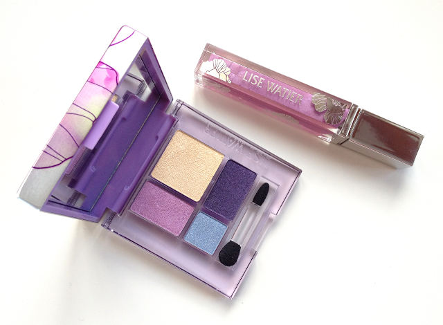
Lise Watier Aquarella Spring 2012 Lipgloss and Eyeshadow Quad

Doesn't that immediately make you think of Easter egg hunts and blooming lilacs and breezy brunches?
So, so pretty.

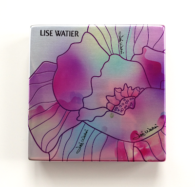
Lise Watier Aquarella Spring 2012 Eyeshadow Quad


Indirect natural light.
Lise Watier Aquarella Spring 2012 Eyeshadow Quad
Artificial light.
In sunlight.

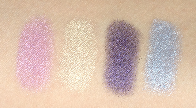
These are the first Lise Watier eyeshadows I've purchased, so my expectations were pretty much a blank slate. The pigmentation in these is what I would consider medium, with the purple being the sheerest upon first swipe. (The purple also has a faint blue duochrome that is visible under artificial light, which I was pleased to discover.) They can be built up to a point, but I think the effect is meant to be more diaphanous and ethereal, rather than intense.

They all have a delightfully silky, smooth texture and a delicate sheen, and feel almost like satin when you touch them with your bare finger. They remind me a bit of the Lancome quint shadow texture, though perhaps not quite as slippy.

The overall effect of wearing these is akin to a soft-focus watercolor - hence the name, Aquarella. These are shades to wear if you want to evoke a gentle, feminine grace.


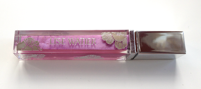
Lise Watier Aquarella Spring 2012 Lipgloss

Lise Watier Aquarella Spring 2012 Lipgloss
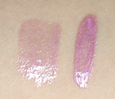
Indirect light.

Indirect light, different angle.
Lise Watier Aquarella Spring 2012 Lipgloss
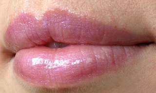
Indirect natural daylight.
Lise Watier Aquarella Spring 2012 Lipgloss
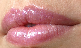
Same light, different angle to show glossiness.

Rose Aquarella is a lilac-pink gloss with very fine blue-violet shimmer, as well as a teeny touch of gold shimmer. Like the quad, it creates an ethereal and feminine effect. 

The texture is smooth, very glossy without being vinyl-shiny, just lightly tacky as it dries (which increases wear), and nicely hydrating. Probably one of my favorite gloss formulas. Applied over lipstick it tends to cool and soften the color. It also has a distinctive floral fragrance, which fits in with the theme, but which I wish had been omitted.

I actually had a hard time locating this one when I first went on the hunt, as it had sold out in a couple of the Pharmaprix locations I checked. They have probably restocked since, but you never know. If you like it, I would recommend snatching it up, lest you regret it.

Availability: Pharmaprix, Jean Coutu, The Bay, the Lise Watier website. The quad is 36$ CAD and the lipgloss is 20$ CAD.

Pros: Soft, wearable textures and colors, difficult to overdo. Beautiful packaging that is a treat to pull out of your bag. Reasonable prices for a department store brand.

Cons: Pigmentation of the quad is on the sheerer side if you prefer a stronger look, and a primer is best for longevity. Floral fragrance in the gloss can be a deal-breaker.

(I purchased these from Pharmaprix/SDM.)