June 27, 2013

Charlotte Ronson Eyeshadow Palettes (Sephora Sale)

Since I mentioned these in my Cheapies and Freebies post, I wanted to put up some quick pictures and swatches, in case any of you want to take advantage of their discounted pricing on Sephora. (They range between 10$ to 18$. A couple of them are no longer available, but I'm including all of them for reference.)

These are the palettes in their external packaging - I only wish the same design was printed on the actual case.

charlotte ronson eyeshadow palettes
Top row: Henrietta, Angela, Dani
Bottom row: Nicole, Drea, Lake

Charlotte Ronson Eyeshadow Palette Henrietta
Henrietta


Henrietta is one of the better palettes, with only the peach shade to the left being a bit on the thin and sheer side. The other three shades have great texture and solid pigmentation, though all the shades are dupable.

Charlotte Ronson Eyeshadow Palette Angela
Angela


Angela is ok - the warm, dirty grey and the heather shade have great texture and payoff, while the plum is thinner and drier, and the glittery violet black is patchy and blends poorly. (The glitter doesn't adhere well either.)


Charlotte Ronson Eyeshadow Palette Dani
Dani


This one made me sad, because the shades were so pretty. The pink and the mauve on the left are really sheer, dry and patchy however, and blend away to nothing. The lilac shade is lovely however, with medium pigmentation and more shimmer than is evident in the swatch. The dirty plum on the right is also more sheer, but it actually blends out well on the skin - it's not going to be an intense shade, but it's a good shader/crease color, and in combination with the lilac it looks quite pretty.

Charlotte Ronson Eyeshadow Palette Nicole
Nicole


Nicole is probably the best out of the bunch, in terms of both pigmentation and texture. The shades are all dense, fairly creamy and have terrific payoff. The brown is perhaps a touch drier, but not in a way that has an impact on application.


Charlotte Ronson Eyeshadow Palette Drea
Drea


Drea has a few drawbacks (the pale peach and especially the black would benefit from more pigment punch) but I am quite fond of the colour combination here. Maybe it's just my affection for the actress that inspired the palette? Either way, this makes for a nice smoky eye look, with the matte peach-tan shade working as a good gradation tone between the silver/black and natural skin (assuming your colouring is similar to mine).

Charlotte Ronson Eyeshadow Palette Lake
Lake


Lake is a mixed bag. The melon shade is fairly sheer and can blend out to nothing. The silvery pink and the taupe are excellent, and the periwinkle blue is gorgeous - if you apply over a creamy primer and blend carefully, as it is pigmented but powdery, and will blow out too easily.

Overall I found that these palettes differed wildly in quality, which is unfortunate for such a small line. I suspect that if a customer purchased one of the more problematic palettes, they would be disinclined to investigate the brand further. Which is a shame, because the good shades are indeed very good, and I like many of the colour combinations. This is a co-branded line that Sephora did in conjunction with Charlotte Ronson, and it feels more like a vanity project than a serious attempt at creating a legitimate brand. Especially when compared with a brand like Kat Von D, which gets it really right most of the time.

So what about you guys - have you tried anything from this line? Or are you thinking of picking something up now that it is in the Sale section at Sephora?

(I purchased these items.)

June 10, 2013

L'Oréal Summer 2013 Nail Collection - Colour Riche Nail Colour and Top Coats

The evolution of the nail polish industry is a fascinating thing to behold. I remember back when wearing a pastel blue was the height of transgressing the norm. (If you're curious, it was the early 90s, and the polish was by the original Hard Candy.)

In the last couple of year, it seems like nail polish has replaced lipstick as the item women will indulge themselves with during economic downturns, and the industry has exploded with options. It seems to have been fed by the what-the-hell experimental vibe of home frankening and the glitter-happy Etsy nail entrepreneurs in the same way that street style feeds into the fashion industry. I've never seen so many interesting textures and finishes and colour palettes coming not only from salon lines like OPI, but also from mass consumer brands. I love it!

L'Oréal, for example, is offering some really great options this summer, including transformational topcoats, nail lingerie (SERIOUSLY awesome) and a modern version of press-on nails. Some things are already showing up in stores, and I want to share a couple of the items I was sent to try.

For May, L'Oréal is releasing 9 new shades in deep tones that might seem counter-intuitive for summer - yet these are classics that are wearable year-round, and appropriate for all occasions. There are also several top coats available in smaller 8ml bottles, with a variety of glitter and special effect textures.


L'Oréal Summer 2013 Nail Collection Colour Riche Nail Colour and Top Coats

This is Greyt Expectations, a refined putty-mauve that leans more grey or more mauve depending on the light. It has a cream finish, and perfect application. There's no streaking, and it's opaque in two coats.

L'Oréal Summer 2013 Nail Collection - Colour Riche Nail Colour Greyt Expectations
Greyt Expectations, two coats.
I added one layer of the Confetti Top Coat over the Greyt Expectations.

Confetti is a clear lacquer with mixture of small black and white hexagonal glitter, smaller round black and white glitter, and then the teeniest flecks of iridescent blue that are barely perceptible, but adds a touch of something whimsical. Two coats will give a more obvious effect, but I like the subtlety of one coat. It's almost like a spray of freckles over the nose - it's fresh and pretty, not overdone.

L'Oréal Summer 2013 Nail Collection Confetti Top Coat
Confetti Top Coat over Greyt Expectations, one coat.
I also got to try Breaking Curfew, which is a near-black cream. It does have an undertone of burgundy, but it's almost impossible to tell indoors. It looks black, just a little warmer and softer somehow. It's not an original colour, but it is a great classic to have, especially as a base layer for the top coats. Application was pretty smooth, with none of the bleeding around the cuticles that some vampy shades are prone to. It definitely needs a second coat, and I personally prefer a third to make it really intense, but it is opaque at two.

L'Oréal Summer 2013 Nail Collection Colour Riche Nail Colour Breaking Curfew
Breaking Curfew, three coats.
The Gold Carat Top Coat is a fine but dense gold glitter in a clear base. You could conceivably layer it up to wear alone, but with one or two layers it gives a neat "gilded stone" effect. It was really easy to apply successive layers, without the brush dragging off the previous layers.

L'Oréal Summer 2013 Nail Collection Gold Carat Top Coat
Gold Carat over Breaking Curfew, two coats.
I have to say, as a loyalist to the OPI Pro-wide brush, that I loooooove the brush on these. It's slimmer that the OPI, with a rounded tip that makes it really easy to follow the shape of the nail bed without getting the polish all over the cuticle. I didn't do any cleaning-up for these photos, and trust me, I am not neat about application.


I'm really glad I got a chance to try these - I was really impressed by the formula and the application. The top coats are a great way of expanding the current line, and I'm REALLY looking forward to trying more of them. There are a couple featured in the press release that look awesome. (The Shift Me and The Holographic, if you're keeping an eye out!)

I'll be reviewing one of the press-on nails and some of the nail lingerie shortly! So what about you guys - have you had a chance to check out any of the current offerings from the drugstore?

Availability: Due out in drugstores like SDM/Pharmaprix and Jean Coutu in May. I've seen the new nail polish shades on display already, as well as a few different top coats. More top coats are due out in July. Price is around 7$ CAD for the polishes, a little less for the top coats in the 8ml size.

Pros: Very easy to apply, great brush shape, especially if you have small to medium nail beds and normally find it difficult to apply "clean". Formula was close to perfect on these. The top coats are fun and dynamic and layer well. Confetti has a sparser concentration of glitter compared with Gold Carat.

Cons: The colour palette is for the nail colours is likely to be dupable if you already have a fair-sized collection. The size of the top coat bottles may be too small if you are an avid user of glitter and effect top coats.

Note: final coat of China Glaze Fast Forward Top Coat applied to all swatches.

(These items were sent to me by the brand/PR to consider for review. This post is not compensated or sponsored.)

June 06, 2013

Lise Watier Sun Destination Summer 2013 - Sun Bronzing Powder, Sensationelle Dry Oil and Illuminating Bronzing Gel

I'm continuing in my mission to Pretend It's Summer, Dammit. I've been testing out some of the items from the Lise Watier Sun Destination Collection, which I received last week, and let me tell you, nothing lulls you into a blissful estival dream like sun-shaped bronzers, shimmery lotions and white-floral scented oils.

Lise Watier Sun Destination Summer 2013 Sun Bronzing Powder, Sensationelle Dry Oil and Illuminating Bronzing Gel

I love using a dry oil spray in the summer, as a lotion or cream can sometimes feel too sticky or uncomfortable on overheated skin. A dry oil feels lighter, and if the combination of oils used is well balanced, it will be both nourishing and protective.

The Sensationelle Dry Oil contains: Sweet Almond, Baobab, Argan, Cotton, Plum and Abyssinian oils. The first three especially are highly beneficial oils, and as a whole I found that this absorbed into the skin nicely, leaving behind a satiny finish that should look amazing on tanned skin, especially in the evening. The key for me is to apply on damp skin, massaging in to allow the water to emulsify with the oils. This allows the oils to work into the skin better, while "trapping" the hydration of the water within the surface of the skin.

This is recommended for the body, face and hair, and I have used it on my hair with nice results - a teeny bit on the ends of damp hair lends a lovely shine and controls the summer flyways. As with any oil product, don't over-apply or you'll have pond-water hair. I can't vouch for it for facial care, as I tend to break-out when I use argan oil or sweet almond oil on my face.

Sensationelle has a gorgeous, white-floral scent reminiscent of Tiaré blossoms. I was sure it contained Monoi oil, but it doesn't, so it must be an added perfume. Regardless, it's lush and tropical, yet still a bit breezy. Very appropriate. (Though if you do have sensitive skin, I would also be wary of using this on your face. Scented products tend to be more problematic in facial care.)

Lise Watier Sun Destination Summer 2013 Sensationelle Dry Oil

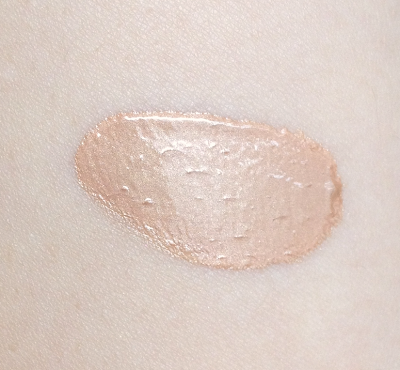
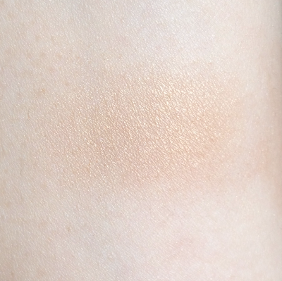
I wan't expecting to like the Illuminating Bronzing Gel as much as I do. When I first squeezed out a dollop, I had a big "Oh HELL no" moment, in fact. This came out looking opaque an waaayyyy too shimmery. I was picturing ABBA-esque 70s Glam cheekbones. Which is a look. Just not MY look.

Then I took the tiniest little drop and buffed it lightly over my cheekbones, and lo and behold, I was disco-free. Applied judiciously, the effect is a subtle, peachy-gold shimmer that should look especially beautiful on medium and olive skin, but is not at all overwhelming on lighter skin tones like mine.

If you're feeling especially wary, it can be mixed with a bit of foundation or moisturizer to diffuse the glow further. A little does go along way, so I can see a tube of this lasting for a while,even if you were to use it more liberally on areas like your collarbone or down your shins for some extra glow. (For extra Golden Goddess points, it can be mixed with the dry oil in the palm of your hand and applied all over.)

Lise Watier Sun Destination Summer 2013 Illuminating Bronzing Gel

Lise Watier Sun Destination Summer 2013 Illuminating Bronzing Gel
Pea-sized drop, spread out slightly.

Lise Watier Sun Destination Summer 2013 Illuminating Bronzing Gel
Tiny drop, buffed out with a eyeshadow blending brush.
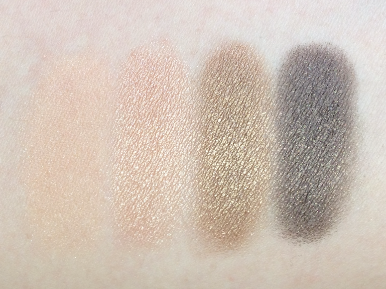
And then there's the Sun Bronzing Powder. Bronzers is something Lise Watier tends to do very well, and this is no exception. The packaging is simple and elegant, and the stylized sun design is pretty, though stunning in the way of Guerlain bronzers. As far as I can tell, the inner gold portion goes all the way down, and is not a gilded overspray.

Lise Watier Sun Destination Summer 2013 Sun Bronzing Powder

Lise Watier Sun Destination Summer 2013 Sun Bronzing Powder

The powder is soft, nicely pigmented, and easy to blend out on the skin. The inner gold portion is quite metallic, so I would be careful about using that by itself, but it has really nice payoff, and can easily be used as part of an eye look. 

The darker outer outer portion is a slightly reddish-toned bronze. It does have some shimmer, but buffed into the skin it reads more sheeny. I would personally use it lightly over the cheek, chin and forehead for a glowy, tanned effect rather than trying to use it as a contour.

The two shades blended together make for a light golden shimmer that is more yellow-toned and obvious on the skin than the shimmer from the Illuminating Bronzing Gel. It's something I would personally reserve for the evening, because the effect is more dramatic (and less flattering to my 35-year-old skin in the harsh light of day), but I love the combo dusted on the cheekbones, with a bit of the darker shade blended over the cheeks instead of blush. It's best paired with stiletto sandals and a long summer night.

Lise Watier Sun Destination Summer 2013 Sun Bronzing Powder
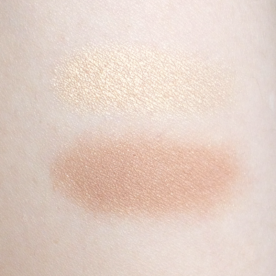
Top: Interior portion of the bronzer.
Bottom: Exterior portion.

Lise Watier Sun Destination Summer 2013 Sun Bronzing Powder
Both sections blended together and applied with a fluffy brush.
Availability: Currently at most Lise Watier counters, including those at The Bay and SDM/Pharmaprix. The Dry Oil is 42$, the Illuminating Bronzing Gel is 30$ and the Sun Bronzing Powder is 39$. All prices are CAD. The Lise Watier website does ship to the US, but this collection doesn't seem to be up just yet. The collection is limited until the end of July.

Pros: All the items have multiple uses - the oil can be used on the body, face and hair, and can be mixed with the gel to create a body glow. The gel can be used as is or mixed with foundation or moisturizer, applied lightly to highlight the face or more strongly to accent points on the body. The bronzer can be used as a bronzer and to highlight the cheekbones, or can be used as part of an eye look. The textures of all the products are lovely, and both the gel and the powder blend out on the skin without any problems, and can be used to surprisingly subtle effect.

Cons: As always, scent preferences are personal, so the white-floral fragrance of the oil may not appeal. If you're acne-prone, I would recommend testing the oil before applying it to your face. The shimmer in the bronzer makes it trickier to wear in the daytime.

(These items were provided by the brand, to be considered for review. This post is not sponsored or compensated.)

June 03, 2013

Estée Lauder Bronze Goddess Summer 2013 - Batik Sun Palette

With the seasons seemingly being a hit-and-miss affair this year, I'm pulling out every summer-themed makeup item in an attempt to invoke some kind of sympathetic magic. Luckily, there is an array to choose from, so though it may not feel like summer, it will darn well LOOK like summer.

The Estée Lauder Bronze Goddess collection offers up the usual suspects this year, with bronzers and burnished tones galore. And as usual, I gravitated to the golds and teals of the gorgeous limited edition Batik Sun palette.

Estée Lauder Bronze Goddess Summer 2013 - Batik Sun Palette

Estée Lauder Bronze Goddess Summer 2013 - Batik Sun Palette

In many ways this doesn't come across as a particularly unique palette. If you have the Estée Lauder Bronze Goddess palette from a couple of years ago, Bronze Sands from last year, or the Stila Sun palette from waaaayyy back when, you're probably in the ballpark of the kind of look that can be achieved with this. That said, there are some real standout shades here as well.

The pale wheat in the bottom left corner is a fairly common shade - medium pigmentation, soft and blendable. Not unique, but almost mandatory it seems.

The light, pumpkin orange is delightfully unexpected, and would looks absolutely killer with blue eyes. It has great pigmentation, a smooth texture and a satin/shimmer finish.

The gold shade is, again, standard, but boasts an incredibly buttery texture and fabulous pigmentation. It applies like a dream.

The Mediterranean teal shade is jaw-droppingly gorgeous. It has a slightly drier texture, albeit not powdery. It takes more patting and layering to build to full intensity, and doesn't blend as smoothly, but for THAT COLOUR, I will make the extra effort.

The purple-tinged taupe (turple? paupe?) in the middle has the same dense, creamy, faultless texture as the gold, with similarly intense payoff. Stunning in the crease and as a liner.

Estée Lauder Bronze Goddess Summer 2013 - Batik Sun Palette

Though this is not one of the gélée-texture palettes that I am so inordinately fond of, it's still a very strong outing from Estée Lauder on the eyeshadow front.

Availability: Still at some counters, and from The Bay online. Also at Nordstrom and Neiman Marcus. Price is 50$ CAD and 48$ USD.

Pros: Textures range from good to excellent, with lovely payoff across the board. The orange and teal shades in particular are more unique. Range for creating a more subtle versus very vibrant eye look.

Cons: The teal shade requires a bit more care in applying and blending. The neutral shades are more easily duped, so depending on your collection this palette may not be cost-effective.

(I purchased this from the EL counter at The Bay.)

June 01, 2013

Cheapies and Freebies - A Roundup Haul

Since I blew most of my seasonal budget on The Makeup Show, I've been trying to stay thrifty with my makeup spending in the last month. I did manage a small haul by taking advantage of GWP offers, Optimum points and some drugstore deals.

This is just a quick pull from my Instagram featuring some of these finds, more in-depth reviews (or at least swatches) forthcoming.

From my local Jean Coutu drugstore, I picked up these Jumbo Glossy Balms from Marcelle. They were discounted 50% off from 12.49$, so 6.25$ each. A little bit less than comparable stick glosses from Cover Girl and Revlon at full price, and I'd been eyeballing that display for weeks.


Also from that same Jean Coutu, I noticed a limited edition nail polish display from Maybelline. Half of the polishes were this polka dot type texture, and the other half were holos. (HOLOS, people. Though  they looked almost like a cross between duo chromes and holos.)

These weren't on sale, but at 3.49$, it was a nice option to temporarily curb my lemming for the Illamasqua speckled polishes. Because I desperately want nails that look like bird eggshells.


And from my local Pharmaprix drugstore, I hauled these goodies - for free, y'all. God bless their Optimum Points program, especially the Beauty Bonus Splurge days. I turned in my points for some lemmings  and impulse try-outs. I saw Caroline from beautymouth.com ardently recommending the Hydraluron Moisture Booster (which is like a super shot of hyaluronic acid to put under moisturizer), so when I spotted it I almost squealed. And I had to try some Shiseido after watching Dick Page's inspiring seminar.  So 90 000 points later, I had me some hooch!


The other day I received an email from Sephora, informing me that as a VIB I could get a free, full-size Bare Minerals duo (The Perfect Storm) with a 35$ purchase. Faster than you can "lunch break" I dashed across the street. I've been wanting to try the Bare Minerals concealer (especially since I'm on a concealer kick with the non-sleep I've been getting), and this gorgeous hot pink (what else??) lipstick also sucked me in.

The duo itself is very nice, with a satin-finish white and a grey-taupe matte, both pigmented like crazy, so it was 30 minutes and 50 bucks well spent. If you can't get to a store, use code VIBREADY to add the duo to your cart.


And also at Sephora, I raided the Charlotte Ronson end cap over the past month to get ALL THE PALETTES, as the whole line is now discounted. (These went from 26$ to 18$, though a few of them were 10-15$. Those the SA actually had to look for in the back, since they weren't even on display any more.)


So all in all, not a bad month for me in terms of getting the most out of my beauty dollar!

What about you guys? Did you come across any great savings or deals? Or conversely, did you haul big?