Purchased at Sephora.
Contains an affiliate link.
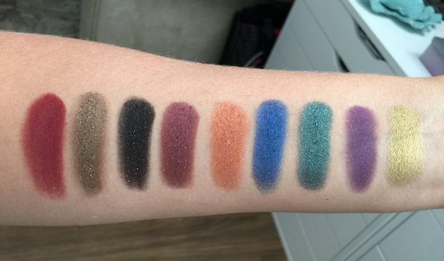 |
| Swatched on clean, un-primed but moisturized skin. |
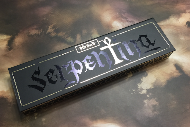
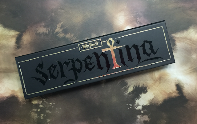
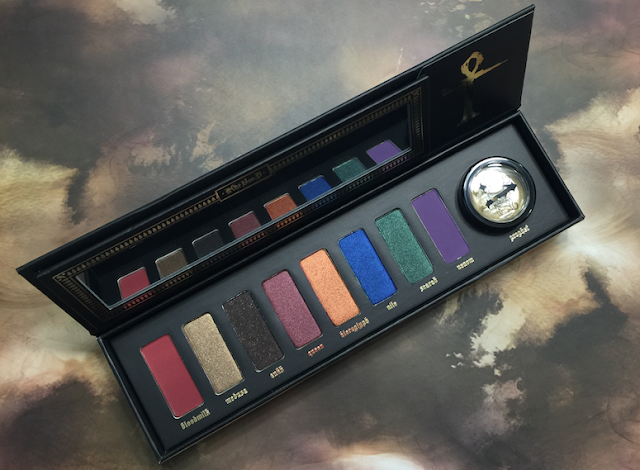
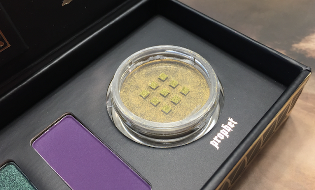
Without a doubt, it's s stunner. Kat Von D's branding is unique and instantly recognizable, and yet it also clearly evokes the theme of Ancient Egypt. If I'm to nitpick anything, it's the bulkiness of the packaging, especially in comparison to her other palettes. I get that it was done to accommodate the pigment jar, but I wish they'd thought of a more elegant solution - especially since that jar also means that the palette is best stored flat, or risk having gold pigment get everywhere.
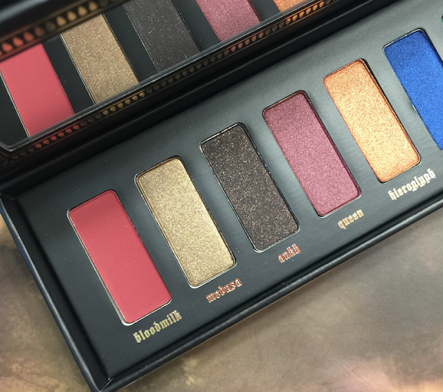
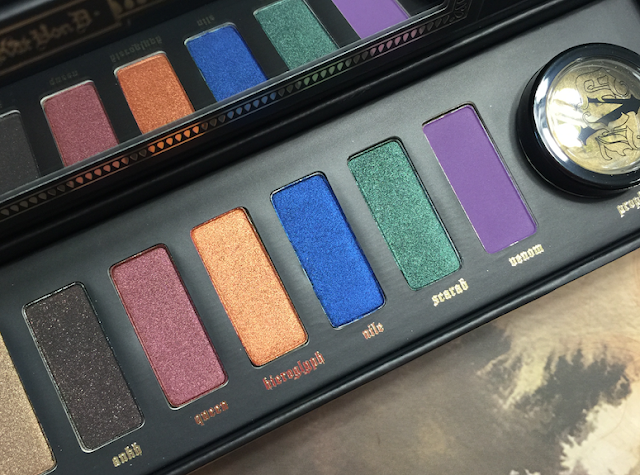
The shades are stunning, as well - brilliant jewel tones and murky, glittery earth tones. One could quibble about the lack of transition shades, but that's a lazy criticism. Chances are, if you're buying a palette with this kind colour range, you're not the type of beauty junkie with a dearth of browns and taupes and camels in your collections.
They look good. Really, really good. I just wish they were as easy to apply.
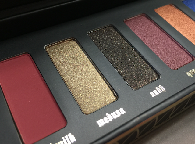
Bloodmilk is the one I was most concerned about. I knew going in that vegan eyeshadow formulations could be especially challenged by red tones, but this one hit it out of the park. Over a primer, the colour packs on true to pan, and blends out without a hitch. And it looks GOOD. I always think of red as the kind of shade that best suits blue or green eyes (and an otherwise youthful countenance), but there's something about this particular shade that doesn't make me look a couple of decades too old to be indulging in all-nighters.
Medusa and Ankh have the kind of micro glitter that makes the eyeshadow feel a bit gritty, and difficult to blend out. Medusa is the smoother of the two, with a dirty gold base colour that is just beautiful. I wish they were a satin (or metallic) formulation.
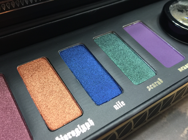
Queen and Hieroglyph, on the other hand, are smooth, creamy, densely pigmented and very easy to work with. Hieroglyph has a slightly flakier texture, but I didn't find it to impact application.
Nile is the biggest disappointment. An incredible rich blue in the pan, it has a dense but crumbly texture when swatched, and applied choppily, with heavy fallout. It's a serious pain to blend out as well.
Scarab has a similar texture and application to Queen and Hieroglyph, and is a stunning colour to boot.
Venom has a texture similar to Bloodmilk, but doesn't build up as well. Like many purples (especially mattes), it tends to look dusty and faded on the lid. As a crease shade, though, it's workable.
Prophet is my second favourite shade from the palette - a rich old gold with a hint of green, that can be used as a glimmer wash all over the lid when applied dry, or as a burnished metallic highlight when applied damp.
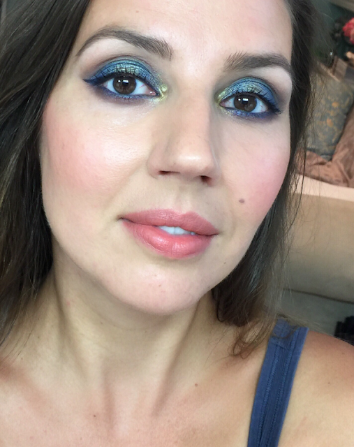
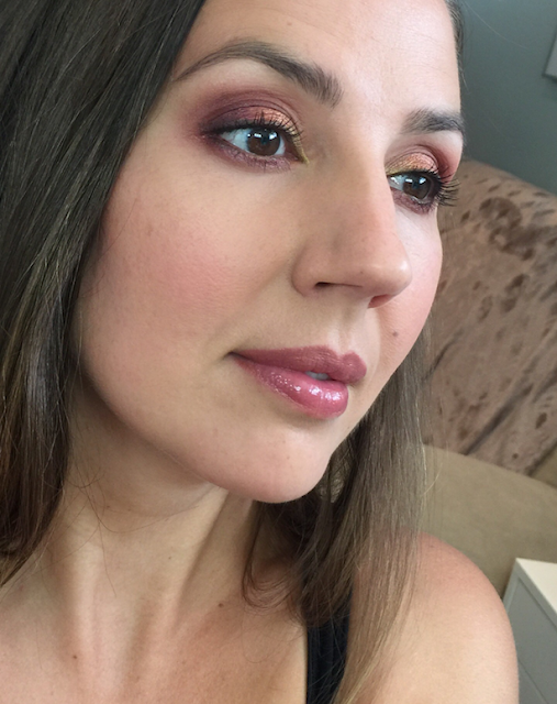
These are the two looks I was able to create using this palette.
Here I used Nile and Scarab on the lid and lower lash line, with a halo and inner corner highlight courtesy of Prophet. I also used the cooler tones from the Shade + Light Eye Contour Palette for the crease, lash line blending and transition.
For the warmer look, I used Bloodmilk in the crease, Ankh on the lash line, Queen in the outer corner, Hieroglyph through the middle and Prophet in the inner corner, mirrored in the lash line. Again I pulled the warmer tones from Shade + Light for the transition and blending out.
That said, I'm loath to return it, because, for some reason, it still speaks to me.
And now that I think of it, maybe being gorgeous but demanding is somehow perfectly appropriate for a palette that so strongly evokes the spirit of Elizabeth Taylor's Cleopatra. ;)
