Since my last post on decluttering my lip products, I've gone ahead with all the categories in my collection. I knew, going through it, that it was only a preliminary declutter, and that I would really need to sit down and make some harder choices, but it was a good place to start.
This is a quick overview of the result.
July 24, 2015
June 10, 2015
Declutter - Lip Things (AKA How I Failed At Getting Rid Of Goo)
And so it goes.
One thing I've realized doing this de-clutter: I have a wildly inaccurate perception of my reviewing capacity. I've pulled out so many items that I purchased (often in multiple shades) with the sole intention of reviewing - and they're still sealed, mocking my intentions with their plastic-coated goodness.
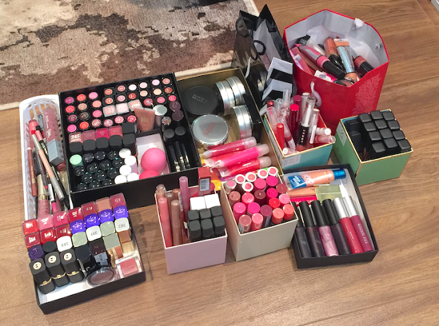
This is the pile of assorted lip products (glosses, stains, lipsticks) that are exiting my collection. I posted it on Instagram and got some lovely comments from people, very encouraging and congratulatory. Which I really appreciated, since I was depressed about how much time and money I've wasted.
But...that pile is still barely a dent. I have a serious lip goo problem. Here's what's left...
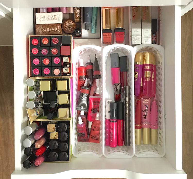
First up - the lip balm and stain drawer. Grouped roughly by cruelty-free (the three trays to the right) and not (pretty much everything else), so when it comes time for Round Two of the decluttering process I can focus on the non-CF side more easily. (That's assuming I don't wind up drinking wine under my desk by the end of this, Sherbatsky-style.)
Side note: those Fresh balms are my favourite, and have been for years, but Fresh is not currently CF. I welcome suggestions for an alternative, since balm is one of those staples that I will have to replace eventually.

Next up is the lip crayon drawer. I pulled out all the Revlon ones that had yet to be used....and kinda threw in the towel after that. These things are so damn easy to use and carry around. I need moral fortitude to give more of them up. (Again grouped by CF/not CF, with the Revlon/Rimmel and Clinique/MAC being the only non CF ones.)

Oh god, the lipgloss. This is some serious goo, here. At least this was easy to parse out. Anything that was still sealed went into the potential sale/giveaway pile. A few things that were open but still new - and that didn't evoke a need to clutch it to my chest protectively - went into the "give it to my mom" pile.
Then there where all the ones that earned a sketchy look during the smell test. Those went into the "toss it" red bag in the picture up top.
And so I'm left with the CF drawer...

And the non CF drawer.

LISTEN, I KNOW. But it only gets worse. Following the same strategy as above...
....the CF lipsticks.

And the non-CF lipsticks.
(And yes, I know the Clinique ones are still boxed. I just bought them before I started this whole thing, and I can't make myself let go of them just yet. Because....reasons.)

WHY DO I HAVE SO MANY OF YOU?? WHY MUST YOU BE SO ADORABLE IN YOUR LITTLE BULLETS AND PRETTY COLOURS?
Also, is it time for wine?
One thing I've realized doing this de-clutter: I have a wildly inaccurate perception of my reviewing capacity. I've pulled out so many items that I purchased (often in multiple shades) with the sole intention of reviewing - and they're still sealed, mocking my intentions with their plastic-coated goodness.
This is the pile of assorted lip products (glosses, stains, lipsticks) that are exiting my collection. I posted it on Instagram and got some lovely comments from people, very encouraging and congratulatory. Which I really appreciated, since I was depressed about how much time and money I've wasted.

But...that pile is still barely a dent. I have a serious lip goo problem. Here's what's left...
First up - the lip balm and stain drawer. Grouped roughly by cruelty-free (the three trays to the right) and not (pretty much everything else), so when it comes time for Round Two of the decluttering process I can focus on the non-CF side more easily. (That's assuming I don't wind up drinking wine under my desk by the end of this, Sherbatsky-style.)
Side note: those Fresh balms are my favourite, and have been for years, but Fresh is not currently CF. I welcome suggestions for an alternative, since balm is one of those staples that I will have to replace eventually.
Next up is the lip crayon drawer. I pulled out all the Revlon ones that had yet to be used....and kinda threw in the towel after that. These things are so damn easy to use and carry around. I need moral fortitude to give more of them up. (Again grouped by CF/not CF, with the Revlon/Rimmel and Clinique/MAC being the only non CF ones.)

Oh god, the lipgloss. This is some serious goo, here. At least this was easy to parse out. Anything that was still sealed went into the potential sale/giveaway pile. A few things that were open but still new - and that didn't evoke a need to clutch it to my chest protectively - went into the "give it to my mom" pile.
Then there where all the ones that earned a sketchy look during the smell test. Those went into the "toss it" red bag in the picture up top.
And so I'm left with the CF drawer...

And the non CF drawer.

LISTEN, I KNOW. But it only gets worse. Following the same strategy as above...
....the CF lipsticks.

And the non-CF lipsticks.
(And yes, I know the Clinique ones are still boxed. I just bought them before I started this whole thing, and I can't make myself let go of them just yet. Because....reasons.)

WHY DO I HAVE SO MANY OF YOU?? WHY MUST YOU BE SO ADORABLE IN YOUR LITTLE BULLETS AND PRETTY COLOURS?
Also, is it time for wine?
April 27, 2015
Make Up For Ever Step 1 Skin Equalizer - Redness Correcting Primer, Radiant Primer Yellow, Smoothing Primer
Press samples.
GWP at Sephora.
Contains affiliate link.
Contains affiliate link.
I also tried the old Make Up For Ever primers, and while they definitely had a more palatable texture - lotion-like rather than slippy - I can't remember being particularly blown away. I generally love MUFE as a brand, though, so I was hopeful about the recently relaunched version and jumped on the chance to test run a couple.


The major advantage and selling point for the Step 1 Skin Equalizer (43$ CAD) series is that the range addresses a variety of needs. Rather than billing one primer as a one-size-fits-all solution, MUFE has ten different options on the table - there's something here, theoretically, for every skin type, texture and tone. Better yet, they can be combined for optimal performance. (They suggest combining the redness correcting or radiance boosting primers before the mattifying or smoothing ones, and the hydrating and smoothing before the correcting or radiance ones. My skin is a crazy topographical map right now, so I apply what I need in specific areas rather than layering them, but it's all up to you, which is the beauty of this concept.)
I've only tested three - the Redness Correcting Primer, Radiant Primer Yellow, and Smoothing Primer - so I can't speak to how the texture of each primer varies, but these feel rather similar to each other.
The Radiant Primer Yellow and Redness Correcting have an identical texture: lightweight and a bit creamy, but with that disappears-into-the-skin finish that is the hallmark of a sophisticated silicone formulation. The Smoothing Primer feels a bit thicker, and reminds me of the Benefit Professional - which makes sense, since it needs to have a bit more weight to smooth down those pores and rough edges. It does a similar disappearing act, however, and bypasses that gross, overly slippy feel of the Smashbox type primers.
I would say the colour correcting is fairly subtle. (It's primer, not concealer.) The Redness Correcting does indeed tone down the redness, as does the Radiant Primer Yellow, to some degree. I do prefer the latter, however, as it also boosts the warmth in my skin, whereas the green tinge of the former emphasizes the olive tones. With foundation overtop, it's not a huge deal, and if you really prefer to negate the redness and aren't prone to looking sallow, the Redness Correcting Primer will probably be your pick.
The Smoothing Primer does reduce the appearance of my pores, and helps to minimize the texture of skin around blemishes. It's not quite photoshop, but it definitely helps to create a more even base for my foundation. It also mattifies slightly, though it doesn't control oil much better than any other primer I've tried.
What I especially like about all these primers is how smooth and soft my skin feels after applying them - not tight or flaky, like some primers can leave it feeling. All of them are excellent for getting foundation to apply super evenly, and it nudges up the time-frame for flake-free, shine-free wear.
 |
| Smoothing Primer, Radiant Primer Yellow, Redness Correcting Primer |
On the left, my bare skin, with some moisturizer that was applied about 45 minutes before the picture. I've been having some kind of skin reaction to skincare samples I was testing (waaaaayyyyy too many at once, hence The Red Spot of Rage).
In the middle, I have the Smoothing Primer applied to my nose, forehead and my inner cheek area. You can see the mattifying effect, and the way the pores are less obvious. The slight texture in my undereye area is also softened. I used the Radiant Primer Yellow on my cheeks, jaw and chin, and some of the redness is attenuated.
On the right, I've applied one layer of foundation (MUFE Mat Velvet, with a tiny drop of Ellis Faas to cut through the matte finish somewhat), with a bit more dabbed over the TRSoR. As you can see, the application is really smooth and even.

And the full makeup...

Are any of you trying these new primers out? What do you think? I'm quite tempted to give the Mattifying and Hydrating ones a go, down the line. In case you're thinking about making a Sephora order soon, you can choose between four deluxe sized samples with the code MUFESKIN (with a 35$ CAD minimum purchase, I believe).
(Items provided by the brand, aside from the GWP sample from a Sephora order. This post is not sponsored or compensated.)
April 26, 2015
Urban Decay Sheer Revolution Lipstick - Sheer Ladyflower and Sheer Obsessed
Press samples.
Affiliate link.
Affiliate link.
The Sheer Revolution Lipstick (26$ CAD) range from Urban Decay has been out for a little while, but I just recently got to try a few shades: Sheer Ladyflower and Sheer Obsessed. I've been pretty obsessed with either straight up balms or more opaque cream finish lipsticks, so these weren't high up on my radar. I'd heard good things, and I was probably going to snag a few, but I wasn't storming the gates for them.
The more fool I.


The packaging is similar to the regular Revolution Lipstick, with a fluid and relatively weighty metallic bullet casing, this time in a violet chrome as opposed to pewter.
Unlike the bulky packaging that UD tends towards when it comes to their palettes, this is all sleek and chic, but still totally modern and cool. I feel cool carrying this in my purse. :P
 |
| Sheer Obsessed and Sheer Ladyflower |
 |
| Sheer Ladyflower and Sheer Obsessed |
I wouldn't say they're particularly hydrating, but again, comfortable feeling. They're quite shiny, almost juicy initially, but that settles. Wear time is minimal, however. I don't think I've gone longer than an hour and half without needing a touch up, so be warned that you may be going through that tube pretty fast.
These didn't settle into lines or emphasize dry patches, and had the nice effect of smoothing out the lip slightly, either due to the shine or the more balmy texture.
 |
| Top to bottom: Sheer Obsessed and Sheer Ladyflower |
Sheer Obsessed is described as a candy pink, and it's definitely a light, cool toned pink with a milky/pastel tone. I don't think I would have ever thought to pick up a shade like this, as I would have assumed it would look too light or chalky. I think the translucency keeps it from looking stark. It almost has a bit of a lilac tone to it against my skintone, and it's just an awesome shade for spring.
 |
| Sheer Obsessed |
 |
| Sheer Ladyflower |
Have you tried anything from the Revolution range, either the original or the Sheer version? Are there any other sheer type lipsticks that you're currently crushing on?
(Items provided by the brand. This post is not sponsored or otherwise compensated.)
April 25, 2015
Burberry Kisses Lipstick - #77 Blush
Press sample.
What's better than one makeup miracle? TWO makeup miracles. In this case, Burberry is finally available to Canadian buyers via the (relatively) accessible Hudson's Bay website (and presumably certain retail locations), and, almost more importantly for many people, the newest addition to their makeup line is completely fragrance free. (Even if you're not personally that bothered with scented makeup, it's definitely a know skin irritant so kudos to them for removing that issue. Here's hoping they continue with the trend.)
But onto the actual product.
The Burberry Kisses Hydrating Lip Colour (36$ CAD) claims to feature a weightless gel texture, with a buildable formula and 6 hours of wear and hydration. I think it hits most of those marks square on.

There's some fancy ingredient chatter in the copy as well, regarding "shiny polymers" and "tea, lavender, and rosehip", which all sounds very nice, but won't mean much if they don't nail the actual performance piece of the formulation.
In terms of the weightless and buildable claim, Burberry aces it. The gel formula delivers on an extremely lightweight feeling on the lips, and the lipstick just glides without getting stuck in lip wrinkles. It doesn't have the smoothing or plumping qualities of its more buttery brethren, but it sits so light and seamless on the lips that it truly feels like you're wearing nothing at all. With one swipe, the pigment is even but slightly translucent, and deeper on the second swipe. It doesn't have the full-on opacity of a rich matte, but it's definitely buildable coverage. The finish is a soft satin shine that looks natural and pretty, without being overly glossy or goopy.
Hydration claims for lipsticks tend to be a bit overwrought, and I would say it's no different here. I don't get balm-level hydration, that's for sure, but this is a comfortable lipstick to wear. I can't test the 6-hour claim adequately, since I'm not likely to pass up eating for that long, but I didn't notice any significant fading or weird wearing away from application to my next meal. It just kind of settles on the lips and hangs out, doing its thing, until you realize a few hours later that your lipstick still look nice, if less shiny.
I don't know if this is a truly unique formula, but to be honest I don't think I've come across anything with this kind of gel texture that wears this well. If you're looking for something easy to wear for the summer (and the buttery-type lipsticks feel too heavy or goopy) but that still looks polished, this may be worth checking out.
And the packing is, as always, Burberry perfection. Elegant and weighty, with those little details (Burberry checks, magnetic closure) that make the price tag a little less outrageous.

I was able to try the shade #77 Blush, which is a perfectly polished, office-appropriate, but still totally pretty, rose.


So are you guys excited about Burberry finally being available at Hudson's Bay? I am, but I'm even more hopeful that this means HB is FINALLY going to step up their beauty department and online shopping experience to be competitive with Nordstrom and Saks.
(This item was provided by the brand. This post is not sponsored or compensated.)
April 19, 2015
Ardency Inn Modster Manuka Honey Enriched Pigments
Purchased items.
I've had the Ardency Inn Modster Manuka Honey Enriched Pigments (24$ CAD) for a few months now and mentioned them in a haul video, but I thought that they might deserve a proper review, what with the Made With Love sale going on over at Sephora.
I'd heard a bit about this brand because one of my favourite makeup artists, James Vincent, is a brand ambassador. Paid spokesperson or not, James has a lot of integrity and I totally trust his standing up for this brand.
So I bought some of the eyeshadows (or pressed pigments, technically), and I am NOT disappointed. These are freaking phenomenal.


I know that honey is a natural humectant, though I'm not sure how well that function is preserved when it's integrated as an ingredient in a pressed powder formulation. I will say that these are incredibly creamy to the touch, with a rich, smooth payoff that isn't too thick. They have a very playable texture, so they're easy to work with, blending almost by themselves.
The copy claims that these have up to 78% pigment and high grade silicone waxes for long-lasting wear. I do think the pigmentation is fantastic, especially for the shades I've selected (there are a few that are more sheer with a sparkly finish, such as Disco). And over a primer, I didn't have any issues with fading or creasing for over 10 hours, if not longer.
The actual colours are awesome as well.
Rose Gold is a slightly "dirty" variation on the theme, so it translates well to a more deconstructed, rocker look, as opposed to something necessarily pretty and polished.
Peacock is one of those teal/red-brown ducochromes that I had to get, even though I own several iterations of the theme. I will say the green in this is much deeper and emerald-like than in any of the other eyeshadows I have.
Hell is really complex and hard to define - sort of a khaki grey-brown with a slight red undertone? It's insane. And fabulous.
Royal is what I'd consider a "hot" violet - purple with deep pink and blue undertones, and super intense. It has a thinner texture than the other three shades here, but it doesn't lack in the pigment department. If you're looking for a purple that maintains its vibrancy and doesn't wind up looking murky, this is it right here.
 |
| Rose Gold, Peacock, Hell, Royal. |
 |
| Rose Gold, Peacock, Hell, Royal. |
And how they look actually applied: I used Rose Gold in the inner two thirds of the lid and the inner half of the lower lash line, and used Hell through the crease and the outer third of the eyelid and outer half of the bottom lash line. Super simple, a little grungy, but still chic, I think. They blended perfectly, I really didn't have to do much work here.


Here I just added a plum liner from Tarte to the bottom lash line, and slightly intensified the crease color.


(The other makeup worn: Clarins Everlasting Foundation in #105 Nude, Essence All About Matt! Powder, Make Up For Ever Pro Sculpting Duo #1 (bronze shade), MAC Redhead MSF, Make Up For Ever Smoky Lash Mascara, Burberry Kisses Lipstick in Blush. Reviews coming soon for some of these items as well!)
Have you guys tried the Ardency Inn line yet? I really want to pick up more of the eyeshadows, but I'll probably wait for the next Sephora sale in the Fall. I can't say I'm super intrigued in the other products in the line, though. Maybe the foundation (which is a concentrate that can be mixed with other mediums), but I have a feeling Cover FX probably nailed the concept better.
(I purchased these items. Not sponsored or otherwise compensated.)
April 15, 2015
Lise Watier Expression Spring 2015 Collection
Press samples.
By the time it actually feels like Spring, it's time to bid the seasonal collections goodbye. (Oh, Canada.)
So here's one last hurrah for the Lise Watier Expression Spring Collection, as summer waits in the wings.

The packaging on this collection was a vivid splash of colour, a bit of playing around on an artists palette (and totally connecting with the desire to see some bold, beautiful shades after a grey, dreary, never-ending season).
Doesn't this blush look like something you'd see from a plane, flying over the southwest United States? So pretty and original, but still graphic and unexpected (read: non-floral) for Spring.


The three different shades of the Expression Blush Trio (38$ CAD) are a little tough to separate out, and I tend to either focus my brush on the right side for a more coral-peach look, or more on the left for a warm pink.
The texture is soft and velvety smooth, and actually a bit powdery when picked up with a brush, but it looks very natural and texture-less on the cheeks. It has some sparkle in the pan and a bit swatched, but comes up as gently glowing on the cheeks. Very flattering, and almost more of a summer type colour, at least for me. It can be built up very easily for a punchier look over (faux) tanned skin.


The Expression Eyeshadow Palette (42$ CAD) just delighted me as soon as I opened it. Combine teals and olive greens, and you've made me the happiest camper. That said, I don't think this palette actually works all that well by itself, unless you happen to like pastel eyes. But it's perfect for integrating some much-needed colour and pairs well with the embarrassment of neutral palettes I have in my collection.
The formulation here is the same not-quite-cream-not-quite-powder that has been featured in the last few limited collections. It feels really plush to the touch, and some of the shades swatch especially nice, but I find the application can be a little tricky, at least as far as blending the colours together goes. Sometimes they don't buff out or build up particularly well (the mint green was particularly troublesome in this respect, remaining sheer and almost chalky), but they do look amazing once on the lids, with a glow that's not overly metallic or shimmery.
The teal and the olive are by the far the standouts in the palette, and I would easily buy those as singles. The mint is the weakest, as I said, and the peach is almost a little dry and faded when applied. The gold is oddly chunky, kinda thick to apply, but is works as a highlight.
Lasting power is average/good, maybe 7 hours before I see some fading (over primer).
This is a fairly simple but bright look using the palette, and a barely-there application of the blush. I managed to use all the shades on the eyes, going from yellow on the inner corner, through mint and teal on the lid to the outer corner, with the olive deepening the crease and smudged into the lash lines. I used the peach very lightly as a transition shade.

The summer collection is coming out soon, but these guys are still available at Lise Watier counters. (And if not, keep an eye out for the online warehouse sale in the fall, as past collections tend to pop up regularly.)
(Items were provided by the brand. This post is not sponsored or otherwise compensated.)
April 14, 2015
Kat Von D Innerstellar Palette
Purchased item.
So at this point I pretty much auto-buy anything Kat Von D. There have been some misses, certainly (the mediocre Holiday palette, the underwhelming lipstick re-launch), but more often than not, I dig it. And honestly, KVD herself is growing on me, even though she has had some equally unfortunate missteps (see: her gross affair with Jesse James, the "Celebutard" controversy). She just seems so grounded and actually sweet in her tutorials, and genuinely passionate about her brand. Her instagram is also chock-full of interesting bits about art and literature, which is not at all what I had in my head about her.
ANYWAY.
On to the Interstellar palette (55$ CAD at Sephora).


Pretty, right? I love the groovy packaging design, and I was drawn to the cool-toned, neutral-leaning shades, balanced by a glimmery lilac and vibrant eggplant purple.


Performance-wise, most of the shades are spot-on with the quality I've come to generally expect: soft, creamy, not overly dense, but well-pigmented and blendable, lasting a work day over primer without fading. But there are a few exceptions.
The most iffy shades are actually in the first "quad" in the palette. The ice pink being a bit sheer and powdery, so while it's not a shade that I'd apply over a larger area, it works for the tear duct area, and has enough iridescence to add a duochrome flash to a colour layered underneath. The cool taupey/plummy brown is great, an easy satin-finish shade that's perfect for the crease. The shark-grey is maybe a bit sheer as well, but otherwise lovely.
The purple, however, was my biggest disappointment. It has super choppy payoff, and fades out like you wouldn't believe. To get it to show up on the eyelid, I had to use primer AND concealer AND a setting spray to wet the brush, and it still showed up more ashy than it does in this swatch. If you're buying the palette with this shade in mind, don't. There are definitely better options out there.

But then if you're in it for the cool neutrals, you have some great ones in the middle quad. All of these are beautifully textured. LOOK AT THAT PEWTER. The lilac is gorgeous as well, especially layered over the gray.

The final quad is good too, with the vanilla satin being the weakest, but for a brow bone shade it's actually just right, as it blends out the transition shade without adding extra frosting. The shimmery taupe is perfect, and the silver is out-of-control pigmented, definitely the richest feeling shade as well. The black is about average, pigmented but a touch choppy, but nothing daunting.

It's probably not one I'd recommend as a starter palette (not quite enough variation, since everything leans to one side of the spectrum, and heavily favours the medium shade range), nor would I urge the serious makeup aficionado to prioritize it, since they'd probably have these types of colours already. If you're a KVD collector, on the other hand....well, I don't have to convince you, since you probably already do have it.
My personal feeling is that I probably loved it a lot more initially, but that bust up with the purple broke my heart a bit. That said, I do find myself reaching for it quite a bit when I'm looking for that perfect crease colour.
I have a couple of looks here to show you how it applies. The one on the left is a typical cool-toned, work-appropriate, classic eye look, which this palette is perfectly suited to. (I've also rocked out a fantastic grungy, silver smoky eye with it.)
The picture on the right was my attempt to get the purple to show up with some kind of vibrancy (with grey contact lenses for some added contrast). I'm sure someone with more skills could put together a more flattering look, but it doesn't change the fact that's it's a righteous mess to work with, and actually started looking grey and faded within a couple of hours. (No such issues with the rest of the palette.)

Have you guys tried Interstellar or any of the other KVD palettes? What do you think of her line in general?
(I purchased this item. This post is not sponsored or otherwise compensated.)
March 29, 2015
Makeup Organization: Hygiene Station and Makeup Brushes
Despite appearances to the contrary, I'm actually not a naturally neat person. It's a running joke both at work and at home that I leave a trail of chaos behind me, and I can be found by following the detritus of a dozen or so half-finished projects (and ice cream bowls) scattered about. One of my dogs has wolfed down more than one errant sock I've forgotten to put away (even though somehow its mate managed to find its way to the hamper).
My brain is Pisces-typical: non-linear, unmoored and tangential.
And yet, somehow, I'm also an organization freak. I get a dopamine rush from the sorting process. I get excited about storage boxes the way some people get excited about Disneyland. I'm always looking for a better way to store and display the things I love.
And then that just goes up to eleven when the Spring Cleaning bug hits. Last week that meant tweaking part of my vanity, specifically my hygiene and brush organization and storage.
With the way I've set up my Alex units to form my vanity, I ended up with a blank wall to one side. It looked a little bit awkward, and struck me as a waste of space, but I couldn't figure out what to put there considering the space restraints created by the dimensions of the units and the space taken up by open drawers. I then came across some storage boxes (see?) and a cute little metal rack at Homesense, and inspiration struck. Up until now I had my extra makeup brushes and hygiene supplies in a cabinet on the other side of the room, and I figured having everything set up closer to the actual vanity would be more practical. And now I finally had a way of making that set up aesthetically pleasing as well.
I asked Androo to shimmy the vanity over to the right by a couple of inches to create enough clearance for the drawers, and then he kindly put the rack up for me (god, I love that man). I then stacked the two storage boxes below (again, with enough clearance for the drawers of the Alex unit to open), and also added old tea set and perfume set boxes for extra storage.
(The big glass mason jars on the Alex unit to the left are where I keep q-tips and cotton pads.)

The top shelf of the rack is where I now keep my "cleaning" supplies: alcohol in a glass spray bottle, various makeup removers, spot brush cleaner, makeup wipes, hand cream (because alcohol is drying).
The bottom shelf contains little bins for makeup brushes and sponges that need to be washed. Instead of putting dirty brushes back into the jars on my vanity (to take up space and fester their bacteria on the clean brushes), they get popped in these bins, and then I can just grab one and go to the sink with it. This way I also don't get overwhelmed with the amount of brushes that need washing, as I can do a bin at a time and rotate them back in.
(The little gold pouch contains my travel set of Shu brushes, simply because it wedges neatly in that little space behind the bin.)

In one of the new storage boxes I have backups of wipes, sponges, cotton pads, paper towel and makeup remover. (The other box on the bottom contains PR info sheets and such, since it's something I like to keep for archival/reference purposes but don't need constant access to.)


These are the brushes I parted with. Some where just cracked and otherwise broken (on the floor on the left) and went into the trash. The rest were brushes that didn't pass the criteria. This was especially the case for brushes where I had better quality options.
I found that I almost all of my Sigma brushes failed by that measure. Aside from the paint peeling from some of them, the bristles felt a lot rougher than I remembered, particularly in contrast to the brushes I'd recently invested in. I don't think they're good quality brushes, honestly, and they don't hold up well over the years. Thanks, youtube, for suckering me. *fistshake*
I also passed on the majority of my Coastal Scents and Crown brushes, and some Sonia Kashuk ones from a set that didn't pass muster or where just not ones I see myself using.
All of these have been cleaned and re-homed with the the daughter of a friend.

I didn't do any major re-organizing of my vanity, but I figured an overview of how I have it set up might be nice?
This is where I keep my skin prep. The cake stand (from Chapters) has some of the moisturizers and toners I currently use (minus the Embryolisse, which I had just used). The little teal bowl (from Anthropologie) has some samples I'm trying out. The two white bird bowls (also Chapters) have my clean beautyblenders and assorted bits.

These are the same jars I've had for a while, which are technically coffee mugs and flower pots, again from Chapters. I swapped out the dry rice for polyfill from Michael's, because I got paranoid about bugs. :P
I have them sorted by function, best as possible:
Concealer and lip brushes, eyeliner and detail brushes, laydown and buffing brushes, cheek and blending brushes...

Natural hair powder brushes, synthetic powder brushes, foundation brushes, highlighter/contour and precision powder brushes. And then all the Real Techniques in a mug without polypill, because their chubbier bases kept scattering all the beads when I pulled them out, which was making me INSANE.

I would say the majority of my brushes in rotation right now are MAC, Zoeva, Glamcor, and Real Techniques, with some scattered in from Sonia Kashuk, Senna, Hakuhodo, Marc Jacobs, Chikuhodo, London Brush Company, Inglot, Wayne Goss and Cover FX.
I did just purchase a few from the Walmart brand synthetic line to try out, but since incorporating a few really high quality brushes recently, I think my future purchases are going to be investments. I hate being a douche-y snob, but there really is no comparison between a higher-end Japanese-made brush and the mid or lower end equivalent in terms of application and the feeling on the skin. Especially with natural hair brushes.
So that's it for now! Let me know if you want me to continue with these kind of posts. :)
My brain is Pisces-typical: non-linear, unmoored and tangential.
And yet, somehow, I'm also an organization freak. I get a dopamine rush from the sorting process. I get excited about storage boxes the way some people get excited about Disneyland. I'm always looking for a better way to store and display the things I love.
And then that just goes up to eleven when the Spring Cleaning bug hits. Last week that meant tweaking part of my vanity, specifically my hygiene and brush organization and storage.
With the way I've set up my Alex units to form my vanity, I ended up with a blank wall to one side. It looked a little bit awkward, and struck me as a waste of space, but I couldn't figure out what to put there considering the space restraints created by the dimensions of the units and the space taken up by open drawers. I then came across some storage boxes (see?) and a cute little metal rack at Homesense, and inspiration struck. Up until now I had my extra makeup brushes and hygiene supplies in a cabinet on the other side of the room, and I figured having everything set up closer to the actual vanity would be more practical. And now I finally had a way of making that set up aesthetically pleasing as well.
I asked Androo to shimmy the vanity over to the right by a couple of inches to create enough clearance for the drawers, and then he kindly put the rack up for me (god, I love that man). I then stacked the two storage boxes below (again, with enough clearance for the drawers of the Alex unit to open), and also added old tea set and perfume set boxes for extra storage.
(The big glass mason jars on the Alex unit to the left are where I keep q-tips and cotton pads.)
The top shelf of the rack is where I now keep my "cleaning" supplies: alcohol in a glass spray bottle, various makeup removers, spot brush cleaner, makeup wipes, hand cream (because alcohol is drying).
The bottom shelf contains little bins for makeup brushes and sponges that need to be washed. Instead of putting dirty brushes back into the jars on my vanity (to take up space and fester their bacteria on the clean brushes), they get popped in these bins, and then I can just grab one and go to the sink with it. This way I also don't get overwhelmed with the amount of brushes that need washing, as I can do a bin at a time and rotate them back in.
(The little gold pouch contains my travel set of Shu brushes, simply because it wedges neatly in that little space behind the bin.)
In one of the new storage boxes I have backups of wipes, sponges, cotton pads, paper towel and makeup remover. (The other box on the bottom contains PR info sheets and such, since it's something I like to keep for archival/reference purposes but don't need constant access to.)
And then it was on to the brushes. As I was pulling them out of the cabinet, I realized that I really needed to do a sort and purge before organizing them, otherwise I would be doing unnecessary work. (I debated filming a video, but it was honestly too boring and fast of a process to merit it.)
These are the ones I decided to keep, grouped together roughly by function. These passed the test because they are backups of brushes I rotate regularly (eyeliner brushes, powder brushes), or brushes I use less frequently but still like to have on hand (the Smashbox bronzer brush - that red lacquer handle is everything - the Glamcor finish brush).
Before putting each brush back into my collection, I asked myself whether 1) it was good quality and 2) a truly useful brush and 3) a brush that would rotate to my vanity regularly.
These are the brushes I parted with. Some where just cracked and otherwise broken (on the floor on the left) and went into the trash. The rest were brushes that didn't pass the criteria. This was especially the case for brushes where I had better quality options.
I found that I almost all of my Sigma brushes failed by that measure. Aside from the paint peeling from some of them, the bristles felt a lot rougher than I remembered, particularly in contrast to the brushes I'd recently invested in. I don't think they're good quality brushes, honestly, and they don't hold up well over the years. Thanks, youtube, for suckering me. *fistshake*
I also passed on the majority of my Coastal Scents and Crown brushes, and some Sonia Kashuk ones from a set that didn't pass muster or where just not ones I see myself using.
All of these have been cleaned and re-homed with the the daughter of a friend.
I didn't do any major re-organizing of my vanity, but I figured an overview of how I have it set up might be nice?
This is where I keep my skin prep. The cake stand (from Chapters) has some of the moisturizers and toners I currently use (minus the Embryolisse, which I had just used). The little teal bowl (from Anthropologie) has some samples I'm trying out. The two white bird bowls (also Chapters) have my clean beautyblenders and assorted bits.
These are the same jars I've had for a while, which are technically coffee mugs and flower pots, again from Chapters. I swapped out the dry rice for polyfill from Michael's, because I got paranoid about bugs. :P
I have them sorted by function, best as possible:
Concealer and lip brushes, eyeliner and detail brushes, laydown and buffing brushes, cheek and blending brushes...
Natural hair powder brushes, synthetic powder brushes, foundation brushes, highlighter/contour and precision powder brushes. And then all the Real Techniques in a mug without polypill, because their chubbier bases kept scattering all the beads when I pulled them out, which was making me INSANE.
I would say the majority of my brushes in rotation right now are MAC, Zoeva, Glamcor, and Real Techniques, with some scattered in from Sonia Kashuk, Senna, Hakuhodo, Marc Jacobs, Chikuhodo, London Brush Company, Inglot, Wayne Goss and Cover FX.
I did just purchase a few from the Walmart brand synthetic line to try out, but since incorporating a few really high quality brushes recently, I think my future purchases are going to be investments. I hate being a douche-y snob, but there really is no comparison between a higher-end Japanese-made brush and the mid or lower end equivalent in terms of application and the feeling on the skin. Especially with natural hair brushes.
So that's it for now! Let me know if you want me to continue with these kind of posts. :)
Subscribe to:
Posts (Atom)