February 28, 2013

Collection: Vintage Guerlain Météorites

I've been inspired by Eugenia from Ommorphia Beauty Bar and Toya from Beauty Obsessed to start a series on my makeup collection. It didn't take a lot of convincing, as I love collection posts more than kittens. There's something about seeing all the makeup pretties laid out neatly (and swatched!) that makes both my Pisces and Virgo sides dance around in glee.

I'm still trying to figure out the logistics of how to organize this series (by category? brand? category within brand? colour within category within brand?), but I thought I should start with something that occupies a special place in my collection.

This is the only real vintage piece of makeup I own, and it has a profoundly personal meaning for me.

Guerlain Météorites in the original cardboard packaging.

Label from the underside of the packaging, copyright 1982.

This is one of the first items of luxury makeup my mother owned.

We moved from Poland to France in 1982, during the Communist regime. At the time, Poland was under martial law and my mother could not abide the thought that she would stand in line for hours to try to buy food, only to find out that there was nothing but vinegar left on the shelf. She wanted a better life for her family. My father left the country first to establish himself in the US, and we followed after a year. We were not able to join him in New York right away, and instead made our way to an intermediary stop in France - a stop that lasted two years. When we arrived, my mom had instructions that she had written down in phonetic French, and we each had a bag. At the time, I was a cranky and sick 4-year-old, and acting every bit of it. I'm amazed she didn't pitch me head-first into the Seine.

In retrospect, I know what an extremely brave and selfless thing it was for her to do, uprooting us and taking an incredible chance on a better life. We had some extraordinary friends waiting for us in France, including the matriarch to end all matriarchs, who I came to know as Grandmaman. We also had Anne, who was just...Anne. One of the kindest, sweetest, most elegant women ever, a great friend and soul sister to my mother, and the ultimate image of "chic" that was forever etched in my mind. I don't remember much from that time, but I remember the scent of certain flowers, the feel of lace and fine cotton - and those ladies. (My mother also says I ate butter by the fistfuls, astonished and made greedy by its abundance. But that's a story for a different time.)

Anne was a beautician, and took my mom under her wing. I'm not sure if she bought the Guerlain Métérorites for her, of it's something my mom eventually got for herself in later years. In my memories, they always seemed to be present on her vanity. I was so fascinated by them, by the violet smell and the colours and the shimmer of the powder. Eventually she passed them on to me, presumably so I could play with them the way kids do. Instead they took on an almost magical property, became a little totem of sorts. The beauty junkie in me can be traced back to these little beads, and a French ideal of feminine grace and beauty that, to me, is synonymous with love and generosity.


One of the questions I was asked - repeatedly - after I posted my makeup collection video online was "aren't you worried about your makeup going bad?". To answer that question technically: powder products can last a lot longer than the suggested best-by date, especially if you take care of them. With these, I gently spill them out over a paper napkin and spray them with an alcohol mist, and then clean out the jar with more alcohol. I let everything dry and then decant the beads back in. The process removes any surface bacteria that may be lingering. 

I don't actually use these anymore though - I keep them because because of what they evoke. Makeup may be transient in nature, but its value cannot be dictated by a best-before date.

And yes, it still smells of violets.

February 25, 2013

Clarins Rouge Éclat (Radiance Range) Collection - Palette Éclat Face and Blush Powder

Sometimes it's difficult to get excited about complexion products. Eyeshadows and lipsticks - those have colour and whimsy and drama. Complexion products tend to be those workhorses that go under-appreciated.
And then there are the face palettes from Clarins. If I tend to covet any one item from a Clarins seasonal collection, it's likely to be that. So you can imagine my reaction when I was recently sent a few things to try out from the Rouge Éclat collection (also known as Radiance Range in anglophone markets), and lo and behold - the Palette Éclat was front and centre. There may have been a Balki-worthy dance of joy. (Points if you get the reference. Also, pull up a rocking chair, so we can yell at the kids on my lawn together.)

Let's have a look at this latest beauty, yes?

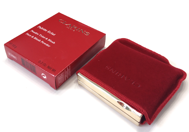
The scarlet and gold external packaging is bright, classic and elegant, and immediately French-feeling to me.

Clarins Rouge Éclat (Radiance Range) Collection Palette Éclat Face and Blush Powder Rouge Eclat Palette


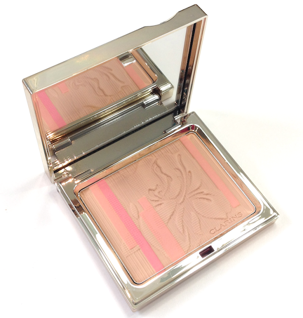
The Palette Éclat is part of Spring 2013 collection, and it is reminder that something beautiful is coming after this Winter That Will Not End. (Seriously, I feel like we're living through that Game of Thrones winter. Summer was twelve years ago, right?)

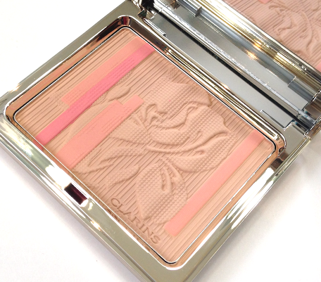
Look at that gorgeous iris detailing!

Clarins Rouge Éclat Palette Radiance Range Collection Palette Éclat Face Blush Powder spring 2013


Clarins Rouge Éclat Palette  Radiance Range Collection Palette Éclat Face Blush Powder spring 2013


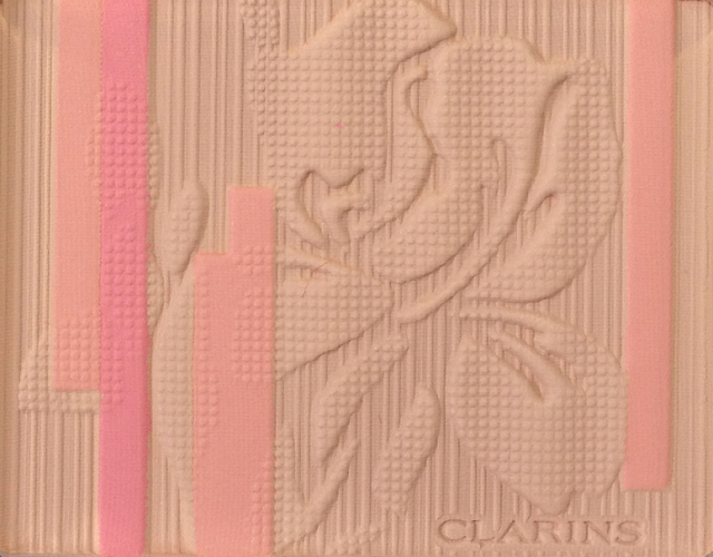
Clarins Rouge Éclat Palette Radiance Range Collection Palette Éclat Face Blush Powder spring 2013


This palette has elements of both a bronzer and a blush. The base colour is a pale beige-y tan that is marginally deeper than my skin tone (NC 20, for reference). It is fairly neutral, but brings some warmth to my skin. With a small highlight or contour brush I can pick up just this colour to use as bronzer or light contour, though not without some maneuvering.

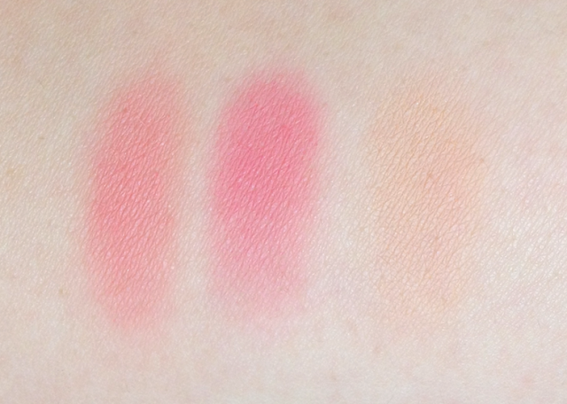
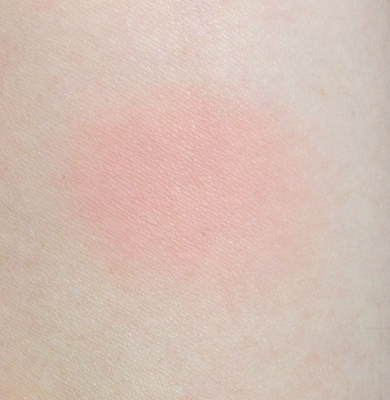
The other two shades are a lovely tulip pink and pinkish peach, arranged in small stripes down the sides of the compact. Don't be fooled by their small size, because they are saturated. You can't use them individually, of course, but if you focus your brush on the left side of the palette you can get a more pink-toned blush shade. Using a bigger brush over the breadth of the palette, the colour that emerges is the one in the swatch at the bottom, a soft coral-peach.

The texture is incredible - super, super finely-milled, so soft and dense. It feels creamy and smooth to the touch, and will kick up powder if you use a stiffer brush. It is not, however, powdery on the skin. It blends well, with no pigment sitting on the surface. The finish is matte and holds up for 6 to 7 hours with no fading.

A kitten-soft synthetic blush brush gives the best application, depositing the right amount of colour for a cheery spring cheek look. Because of the neutral tone of the base shade, this will not yield a super-intense effect - it really is meant to be subtle, warming and fresh. On deeper skin tones than mine the effect may be extremely muted or negligible. It is, however, ideal for pale-skinned redheads and blondes.

Clarins Rouge Éclat palette Radiance Range Collection Palette Éclat Face Blush Powder spring 2013 swatches
Peach stripe, pink stripe, base colour.

Clarins Rouge Éclat Palette Radiance Range Collection Palette Éclat Face Blush Powder spring 2013 swatches
All blended together with a blush brush.

Availaibility: At Pharmaprix/SDM and Murale stores, as well as Nordstrom and The Bay. Price is 40$ CAD and 35$ USD.

Pros: Gorgeous texture that feels ultra-smooth and blends without a hitch. With a smaller brush, can be focused on either side to create a more pink or warm effect. Overall colour is lovely. The imprinted design is so pretty it's almost a shame to erase it with use.

Cons: The delicate nature of the colour means that it has limited potential for deeper skin tones.

(This item was provided by the brand for consideration for review.)

February 17, 2013

Becca Beach Tint - Strawberry, Dragonfruit and Watermelon

Becca Cosmetics are known for a natural, healthy, skin-focused aesthetic - and what better to encapsulate that aesthetic than their signature product, the Beach Tint? These are supposed to be easy-peasy cream stains that can be applied to lips and cheeks for natural colour and water-resistant wear.

Since I've recently become obsessed with cream blushes, I knew I had to give these a try.


I purchased Dragonfruit and Watermelon, and received Strawberry as part of a Gift With Purchase special. (Strawberry doesn't appear to be around anymore, on either the Becca site or Sephora.)

I was a little taken aback by the small size of the squeeze tubes (which are smaller than the OCC Lip Tar tubes). It turns out they're small but mighty. I only needed the tiniest amount to do both my cheeks and to use as lipstick.


The texture of the Tints is a mix of cream and gel, and the fluid can become separated (pressing the tube a few times between the fingers mixes everything back together, much like the Too Faced Shadow Insurance or the Lip Tars).

They appear very dewy when first applied, but as they dry down, there is no tackiness or texture left over - just a stain. Despite the fact that they set quickly, I didn't find them overly tricky to apply. I think that fluid-cream texture makes them really easy to blend. If you goof, just go over the edges with the brush you used for foundation.

The final effect is a supremely natural, flushed cheek - luminous without any shimmer. What's nice about this product is that you can layer it to incredible intensity without sacrificing texture. It works beautifully to create a sunburnt surfer-girl cheek, or the softest English-rose complexion. (Fans of Downtown Abbey, take note.)

Watermelon is a warmer-toned pink that livens up the skin. Dragonfruit is a gorgeous poppy pink that goes on way more mellow than expected, unless you layer it. Strawberry was a more difficult shade for me personally to carry off, but I think it would look lovely on a creamy-skinned redhead.

All of the shades appear more opaque on the lips. You can see me wearing Watermelon in my previous review for the Becca Skin Perfector and Radiant Foundation.

Watermelon.
Dragonfruit.
Strawberry.

These are great as lip stains as well. They dry down completely matte and feel like you're wearing nothing at all. I found them a bit drying to wear alone for long, but that's fine, because they are an excellent base to wear under gloss.

The wear time as a blush was great - 8 to 10 hours easy. As a lip stain, they lasted until a meal, but looked worse for the wear after that.

A big plus for me is the way they are scented to match the fruit they are named for. This partially makes up for a packaging issue - namely, that the tubes themselves are unlabelled! The boxes come with the name, but the tubes themselves do not. I panicked when I realized I had removed them all from the boxes to take pictures and couldn't remember which was which. Thankfully I was able to match them back up with lot number, but that remains a call-out to the brand.


Availaibility: At Sephora.com and the Becca website (which only ships to the US). Price is 30$ CAD and 25$ USD.

Pros: Very easy to use, a little goes a long way. Versatile, can create a natural effect or be layered for intensity. Wears very well. Undetectable finish that looks like skin, and though matte, doesn't look dry or flat.

Cons: Tubes are not labelled with the name.

(I purchased these - and received one as a GWP - from www.beccacosmetics.com)

February 14, 2013

Lise Watier Quatuor - Pastel Power Eyeshadow Quartet

As I mentioned in my review of the Pastel Power Illuminating Beads, I was initially a bit hesitant about the limited edition quad in this collection. Although I don't have a problem using pastels, it's not what I tend to be drawn to.

I was, however, charmed into sitting down for a makeup application by the lovely Lise Watier MUA (hello Erika!) at my local Pharmaprix, and I was so impressed by how she used the Pastel Power palette that I bought it on the spot.


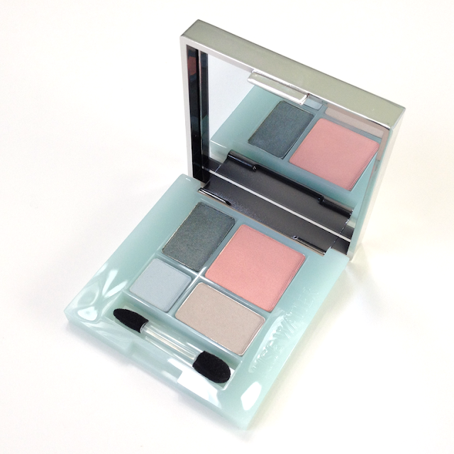
Lise Watier Quatuor Pastel Power Eyeshadow Quartet

The packaging has the same kind of pretty floral detailing that is featured on the Illuminating Beads, with a very retro-feeling pale aqua interior.

Most of the Lise Watier palettes that I have tried contain eyeshadows with a shimmer finish, and a smooth, almost creamy texture. This palette is a little bit different. 

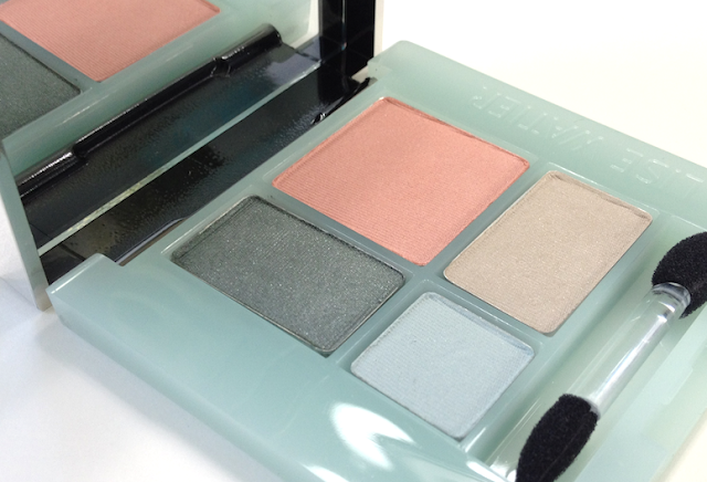
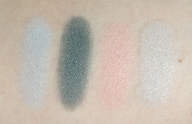
The pale blue and mushroom beige shades have a satin, almost matte finish, and a fine, silky texture. The beige shade has a medium pigmentation that can be applied as a sheer wash for a delicate look, or can be layered for more opacity. It's really nice on its own for a super-simple everyday look if you have a skin tone similar to mine. 

The pale blue has light pigmentation, and can be used for an inner corner highlight or to blend out the edges of the darker teal shade. Over a creamy white base, it can be packed on the lid for a 60s style look, as per the Tippi Hedren look that Lisa Eldridge recently posted. Although it's not chalky, I suspect it will look washed out on skin tones deeper than mine, as it is not opaque enough to build up for enough contrast. It has a fine texture that can brush away easily, so it's best to pat it on with a firm brush.

Both of these shades wear best over a primer, lasting 8 hours for me that way. Without primer, I noticed fading after about 5 hours for the beige, with faster and more significant fading for the light blue.

The smoky, greyed teal shade is the standout for me. It has a touch more shimmer, and a slightly creamier texture than the lighter shades. It also has stronger pigmentation, and I was surprised by the beautiful smoky eye that Erika was able to create with this shade as the dominant piece. I actually don't think I have a comparable shade in my collection, and I do wish this was available as a stand-alone eyeshadow. I would snap it right up!

The light, warm pink shade has a similar finish and texture to the other lighter shades, and can be used similarly to those. BUT. It also doubles as a blush, and beautifully at that. It creates a softly glowy cheek that just embodies spring for me. I love, love, love that this little palette is multi-faceted, and that between all the shades it can create the most delicate look or something much more intense.

Lise Watier Quatuor Pastel Power Eyeshadow Quartet

Lise Watier Quatuor Pastel Power Eyeshadow Quartet swatches


Availability: On the www.lisewatier.com site (and on www.lisewatier.us for shipping to the States) for 36$ CAD and USD. Also at Pharmaprix, Jean Coutu and The Bay locations.

Pros: Super pretty packaging design. Beautiful and unusual smoked teal shade. An all-over pink shade that can double as a blush on lighter skin tones. Fairly versatile palette that can be used for a barely-there, ethereal look or something more dramatic.

Cons: The wear time and intensity of the beige and especially the pale blue is best served by using a primer underneath. The pale blue is prone to brushing away, and is best used as an accent.

(I purchased this item from Pharmaprix.)

February 11, 2013

Lipstick Queen Medieval Tinted Treatment

It takes a special kind of gumption for a young girl of 18 to start her own lipstick line because she is unsatisfied with the options around her. And that's exactly what Poppy King did in 1992 when she created her original, eponymous line.

Fast forward 20 years to the modern incarnation of that same spirit: Lipstick Queen. If you're not familiar with the brand, you should know that you won't find an eyeshadow or a concealer anywhere in the line. Poppy's passion is lips and you will find all nature of lip glosses, lipsticks, and lip balms to suit your every fancy. Her most well-known creation is the two-pronged selection of lipsticks, each shade available as a Saint (with 10% pigment for a sheer application) or Sinner (with 90% pigment for all the opaque drama you could want).

But the item that drew me initially was Medieval Lip Treatment. I have a minor in History with a focus on the Middles Ages, and will happily geek out over anything related. So a lipstick billed as the perfect universal shade that comes packaged as gorgeously as this? I'M THERE.

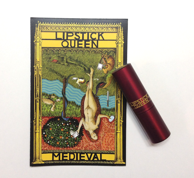
Lipstick Queen Medieval Tinted Treatment

(If you go to the LQ website, you can learn a little bit about the image used by scrolling over it. )

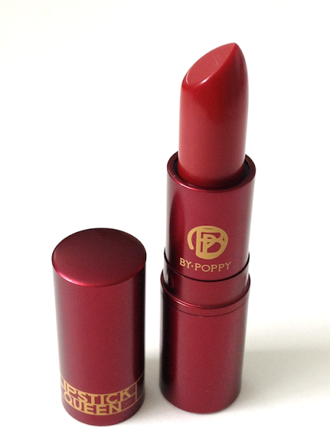
Lipstick Queen Medieval Tinted Treatment


I can't vouch for this being the perfect shade for everyone, but it IS very sheer and despite the colour of the bullet, not particularly red. It is truly a lip balm rather than a lipstick.


Lipstick Queen Medieval Tinted Treatment


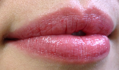
It is extremely wearable. I found that applying it straight on and trying to build intensity resulted in a glossier look than I liked, with the pigment sliding into the lines of my lips. My preferred way of wearing this is to apply it like a balm, let it sink in a bit for the treatment it provides, and then tapping most of it off until all that's left is a faintly shiny, pinkish stain.

It is quite hydrating - loaded with shea butter, mango butter, sunflower and meadow foam seed oil - so the effect is of plumped, naturally flushed lips. It has a comparable feel to something between a Revlon Lip Butter and the Fresh Sugar Lip Treatment, though it is not as moisturizing as the latter.

Medieval veers slightly to the cooler range, but because it's so sheer I do think that it will suit a wider variety of skin tones that something more intense might. It is a "your lips but better" shade.

Natural light.
Lipstick Queen Medieval Tinted Treatment swatch
Applied straight from the tube.
Lipstick Queen Medieval Tinted Treatment swatch
Blotted for stain effect.
Availability: Nordstrom, Beauty.com, Space NK in the US. Price is 20$ USD. It is available in Canada from Saltridges, for 22$ CAD.

Pros: Beautiful, evocative packaging. Nicely hydrating. Super sheer, quite possibly universally flattering colour.

Cons: Balmy texture can turn slippy and bleed or collect in lines on or around the lips.

(I purchased this item from Beauty.com)

February 06, 2013

Lise Watier - Pastel Power Illuminating Beads

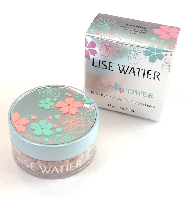
Lise Watier recently launched their Spring "Pastel Power" collection in stores, and, like a moth to a flame, I was immediately drawn in by the super-feminine packaging. When I was offered a makeup application by the Lise Watier MUA at my local Pharmaprix, I jumped right in, even though pastels and I are not generally the closest of friends. She actually gave me a wonderful smoky eye with the quad in this collection (review upcoming), but I was charmed most of all by the Illuminating Beads.

See? So pretty!

Lise Watier Pastel Power Illuminating Beads Spring 2013

Lise Watier Pastel Power Illuminating Beads Spring 2013


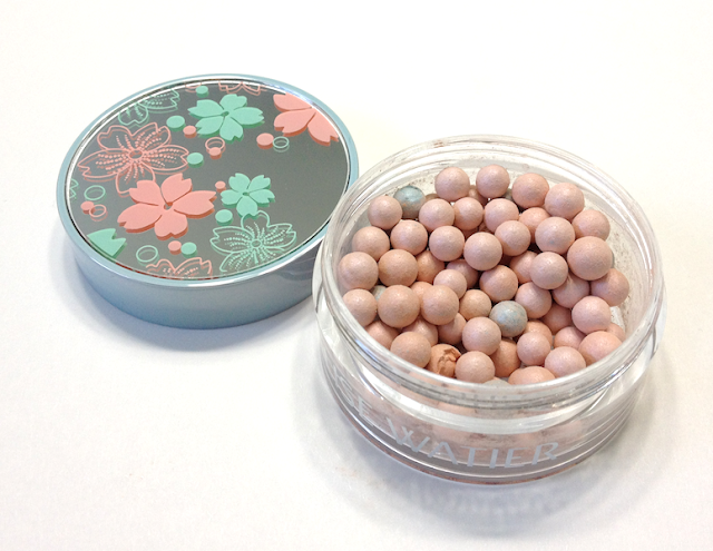
Packaged in an adorable little mirrored container, the beads themselves are about half the size of Guerlain's Meteorites, and have a different texture all together, softer and denser than the latter.

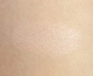
They are also somewhat more shimmery, with the mix of pale peach, pink and aqua beads transforming to a soft, pink-leaning veil on the skin. Because of the relatively pale cast visible in the heavier swatch, I suspect this will show up ashy on deeper skin tones.

The effect is discreet, not disco ball. It is exactly the level of glow that is daytime appropriate for cheekbone or the brow, without looking frosty or glittery. It didn't emphasize the lines around my eyes when I smile. Buffed over the cheeks, it can emphasize pores if you have them, though not more so than most highlighters will.

I was surprised at how long wearing this was, as I could still see a nice glow well into the evening.

Value-wise, this is worth considering if you're lusting after the Meteorites but balking at laying down the cash. At 29$ CAD and 0.6 oz (compared to 67$ CAD for 1.05 oz), the Illuminating Beads offer more than half as much for less than half the price. The value per oz is not tremendously greater, but it is a less wince-worthy hit to the wallet.

Lise Watier Pastel Power Illuminating Beads Spring 2013 swatches
Swatched heavily from a crushed bead.

Lise Watier Pastel Power Illuminating Beads Spring 2013 swatches
Swatched using a fluffy eyeshadow brush.

Availability: At Pharmaprix/SDM, Jean Coutu, the Bay. Available for order via www.lisewatier.us if you're in the US. Price is 29$ CAD and USD.

Pros: Beautifully illuminating and daytime-wearable, lovely soft texture and instant payoff. Long-lasting. Super pretty packaging.

Cons: May be limited to lighter skin tones, does slightly emphasize pores.

(I purchased this item from Pharmaprix.)

February 03, 2013

Clarins Instant Light Lip Perfector - Rose Câlins

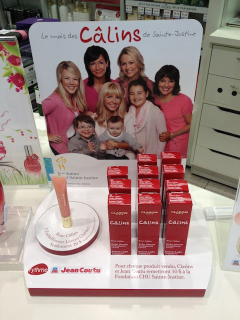
For the past few years, Clarins has teamed with Rythme FM and Jean Coutu drugstores for a fundraising event called "Le Mois des Câlins de l’Hopital Sainte-Justine". The goal is to raise money for the Ste-Justine Pediatric Hospital of Montreal, so that they can continue to provide care and aid to children with rare and aggressive diseases.

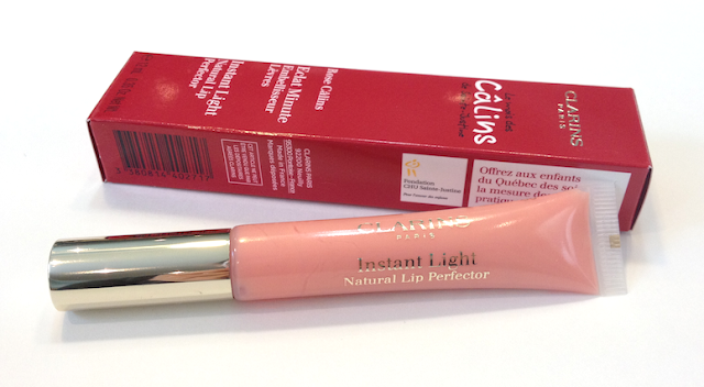
To that end, Clarins has created a limited shade of their Instant Light Lip Perfector, to be sold exclusively at Jean Coutu's Quebec locations. This year's shade is called "Rose Câlins". (For the non-francophones, "câlins" translates as "hugs" or "cuddles".)

Clarins Instant Light Lip Perfector Rose Câlins

For every tube of gloss sold, Clarins and Jean Coutu will jointly donate 10$ to Ste-Justine Hospital. Considering that the selling price is 20$, that 10$ is not a token amount. It's a beauty splurge well worth considering, and I would urge you to give it a look if you're in a Jean Coutu (but do so soon, my local counter was down to their last batch and they didn't expect it to last the week).

I'm not going to do my usual review here, but I want to give you an idea of what to expect.

Clarins Instant Light Lip Perfector Rose Câlins

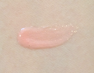
The Lip Perfector formula is both a gloss and a lip balm treatment. It provides a gorgeous shine and just a hint of creamy pink colour with tiny golden shimmer, and is wonderfully hydrating to the lips. This is actually the first Lip Perfector I have purchased (hey, it was a great reason to get it!) and I am really pleased with the softening effect.

My lips also appear to look a little fuller, both due to the gloss and the hydration as the little dry lines get filled out. It also has the most delicious vanilla scent.

Clarins Instant Light Lip Perfector Rose Câlins swatches

Have any of you picked this one up? What do you think of it?

I have to say that I really respect a company (in this case, both Jean Coutu and Clarins) for making a substantial contribution to an organization that directly benefits people in our extended community.

(I purchased this item at Jean Coutu.)

February 01, 2013

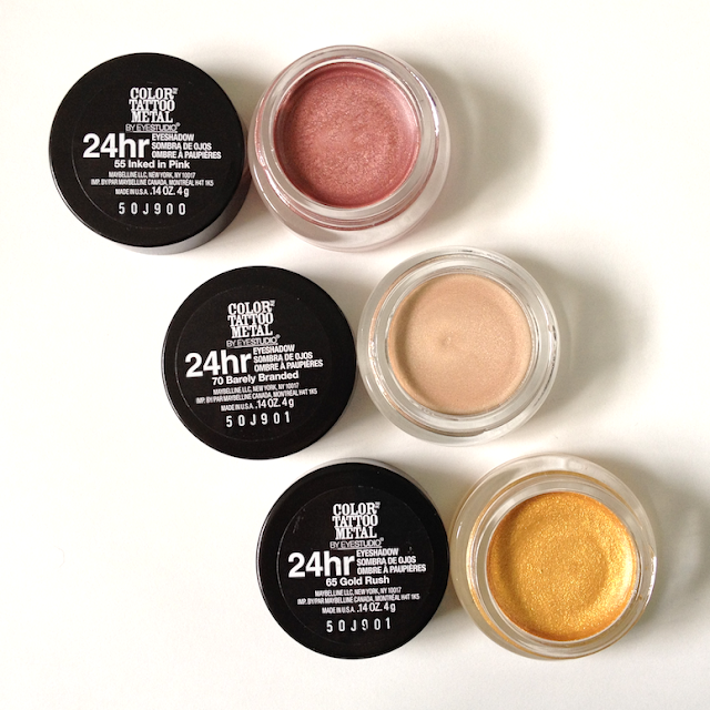
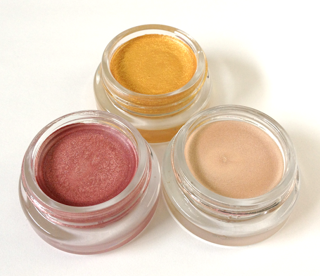
Maybelline Color Tattoo Metal Eyeshadow - Barely Branded, Inked in Pink, Gold Rush

When the Maybelline Color Tattoo Cream Eyeshadows came out, I joined the beauty stampede without hesitation. Over the past year or so, I've acquired most of the regular line-up as well as several from limited collections, and I have yet to be disappointed. (I wisely passed on the purple shade that almost everyone was disenchanted with. What would I do without my fellow bloggers steering me right, I ask you??)

When I saw these Color Tattoo Metal Eyeshadows, I knew I had to grab a few.

Maybelline Color Tattoo Metal Eyeshadow Barely Branded, Inked in Pink, Gold Rush

Maybelline Color Tattoo Metal Eyeshadow Barely Branded, Inked in Pink, Gold Rush

Barely Branded is very similar to Barely Beige, so if you have that one you probably don't need to rush out for this one. 

Both Barely Branded and Inked in Pink have a high amount of shimmer, apply very smoothly and with great pigmentation. They can also be sheered out easily, and that is actually how I prefer to wear them. Dabbed softly on the lid, they give a glowy finish that is gorgeous by itself (sort of half angel/half surfer girl) and great as a base. When you apply a shadow with a less shimmery finish overtop, it gives an interesting dimensionality to the whole eye look.

I find the texture of these to be a slicker than that of my other Color Tattoos, and the resultant slip makes them a touch more vulnerable to moving about when worn alone. With either a primer underneath or with a shadow on top, the wear is extended to 10 hours with no problems. 

Gold Rush is definitely the odd one out. It's not just metallic - it has a gritty texture, as if filled with chunky glitter. Unlike any other Color Tattoos I own, it's a little difficult to apply as it tends to sort of roll up on itself when you try to blend it or get it more opaque. When worn all over the lid, it moves and creases within a few hours, and sheds some glitter fall-out. If you dab it lightly just in the centre of the lid or in the inner corner, it provides some nice glitz. 

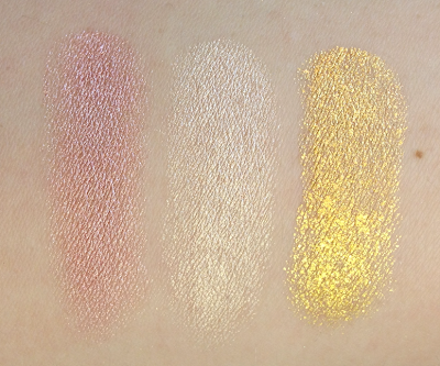
Maybelline Color Tattoo Metal Eyeshadow Barely Branded, Inked in Pink, Gold Rush swatches
left to right: Inked in Pink, Barely Branded, Gold Rush.
Availability: Most drugstores like Pharmaprix and Jean Coutu, though some of the displays are selling out of certain shades. Also available online at Ulta. Price ranges from 6.99$ USD to 9-10$ CAD. (I bought these on sale at 6.99$ CAD.)

Pros: Inked in Pink and Barely Branded have blendable, sheerable textures and lovely shimmer, and good wear that can be extended. Can also be used as bases to multi-dimensional effect under powder eyeshadow.

Cons:  The texture on Gold Rush makes layering and blending tricky, and the glitter fallout discourages full-on application.

(I purchased these from Jean Coutu.)