September 24, 2013

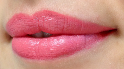
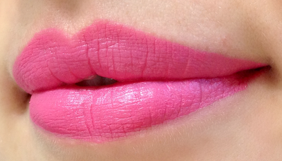
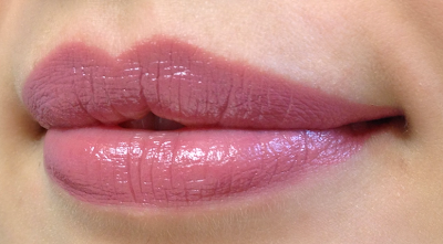
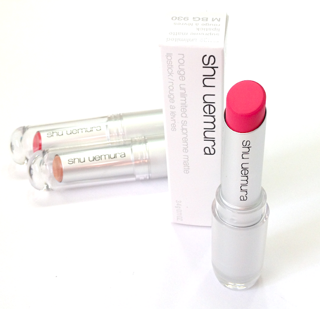
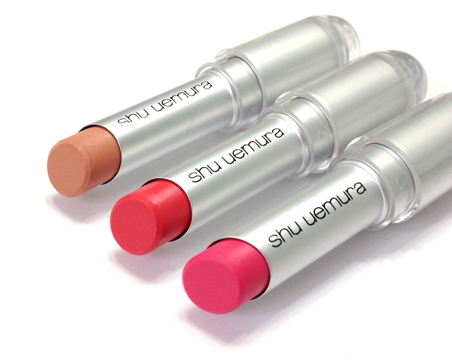
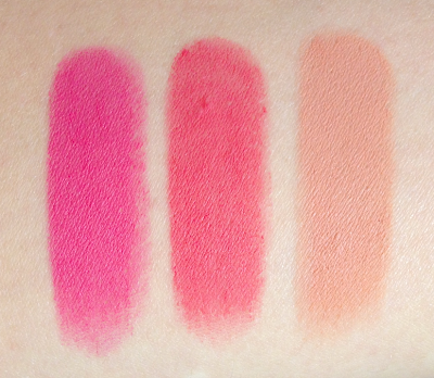
Shu Uemura Eye-conic 30th Anniversary Fall Collection - Rouge Unlimited Supreme Matte Lipstick (M beige 930, M pink 355, M pink 356)

To celebrate their 30th Anniversary, Shu Uemura recently released the Eye-conic collection, inspired by the creative liberation of the 60s and Shu Uemura's own standard-breaking artistry.

Vibrant pinks and corals are unexpected for a fall/winter collection, and I love that! They are perfectly in keeping with the Pucci vibe of this collection, and the matte texture is most definitely autumn-ready. The Rouge Unlimited Supreme Matte range is available in six limited edition shades, three of which I have to show you.

Shu Uemura Eye-conic 30th Anniversary Fall Collection - Rouge Unlimited Supreme Matte Lipstick (M beige 930, M pink 355, M pink 356)


Shu Uemura Eye-conic 30th Anniversary Fall Collection - Rouge Unlimited Supreme Matte Lipstick (M beige 930, M pink 355, M pink 356)

Packaged in Shu's futuristic looking bullet, the formula of these is supposed to have equally advanced qualities, blending together a matte finish and intense pigment with a comfortable feeling on the lips.

In terms of application, this was probably the smoothest-feeling matte lipstick I've ever tried. A lot of mattes tend to feel a bit dry, or tug on the lips as you apply them. These were smoother than silk. They have a lot of slip, and really glide on. They're also very pigmented without feeling thick or heavy. They have some sheen initially, but dry down fully matte shortly after application.


They do remain feeling quite comfortable on the lips, not emollient by any means, but not drying on my lips (though I'm not prone to dry lips). As they are matte, they can emphasize texture and collect in the seams of the lip, which was especially evident with the beige shade. I had the best results dabbing the product in lightly after the initial swipe.

The wear on these was only a bit longer than regular lipstick - maybe 4-5 hours - and I didn't notice as much staining as I'm used to from matte-finish lipsticks.


Shu Uemura Eye-conic 30th Anniversary Fall Collection - Rouge Unlimited Supreme Matte Lipstick (M beige 930, M pink 355, M pink 356)

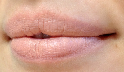
M beige 930 is a slightly peach-leaning nude beige. If you're looking for that perfect "concealer lip" shade, this is probably it. Worn by itself, I don't find it particularly flattering on me, even with a smokier eye, as the combination of the colour and matte finish is too deadening. It is a good base to wear under a shimmery nude-pink gloss.

Shu Uemura matte lipstick Eye-conic 30th Anniversary Fall Collection Rouge Unlimited Supreme  (M beige 930, M pink 355, M pink 356)

M pink 355 is vivid coral-pink. Despite the brightness, it's still super wearable. The shade is pure tropical vacation by way of the Rat Pack, but the matte finish keeps it edgy and modern.

Shu Uemura matte lipstick Eye-conic 30th Anniversary Fall Collection Rouge Unlimited Supreme  (M beige 930, M pink 355, M pink 356)

M pink 356 is a hot Barbie pink. (No kidding, I'm pretty sure my Barbie had high heels exactly this shade.) This one is more 80s than 60s, but again, made sharp and clean with that matte finish and lightweight texture. If you'e not a red-lip lady, but you want to wear something with serious oomph, this is your shade.

Shu Uemura matte lipstick Eye-conic 30th Anniversary Fall Collection Rouge Unlimited Supreme  (M beige 930, M pink 355, M pink 356)

Availability: Currently at www.shuuemura.ca, as well as certain Sephora locations. Price is 36$ CAD.

Pros: Great pigmentation, lightweight feeling, nice "slip" during application. Both pink shades are gorgeous. Matte finish is not overly dry.

Cons: Can emphasize texture and collect in the seams of the lip. Slick texture may not be appealing if you prefer the usual feel of a matte lipstick. Beige shade can go either way - deadening to certain skin tones, the perfect "concealer lip" shade otherwise.

(These items were sent to me by the brand/PR to consider for review. This post is not sponsored or compensated.)
September 23, 2013

L'Oréal Project Runway Fall 2013 Collection

I don't generally like posting about products that are hard to acquire in Canada, but this Project Runway collection from L'Oréal is SO awesome - I had to share it. Hopefully if you are traveling to the US in the near future, this might prove helpful to your own drugstore forays.

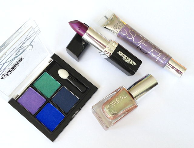
The overall collection is named Electric Fantasie, with four displays bearing distinct themes. Most of the items I picked came from the "Wise Mystic" display, which features strong jewel tones and plum/berry shades. The nail polish is from the "Seductive Tempress" set, which had burnished and nude tones.

L'Oréal Project Runway Fall 2013 Collection
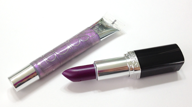
The Mystic's Gaze Quad, The Mystic's Kiss Lipstick, The Mystic's Shine Le Gloss, The Temptress' Power Nail Polish

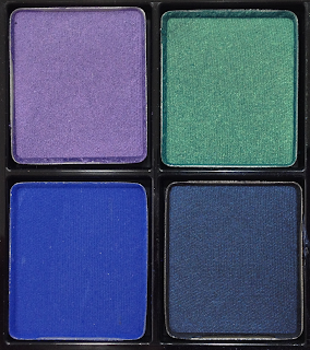
Studio Secrets Pressed Eyeshadow Quad in The Mystic's Gaze: I wasn't sure what to expect, honestly, because drugstore ranges usually fall short when it comes to saturated jewel tones like this.

Studio Secrets Pressed Eyeshadow Quad The Mystic's Gaze L'Oréal Project Runway Fall 2013 Collection

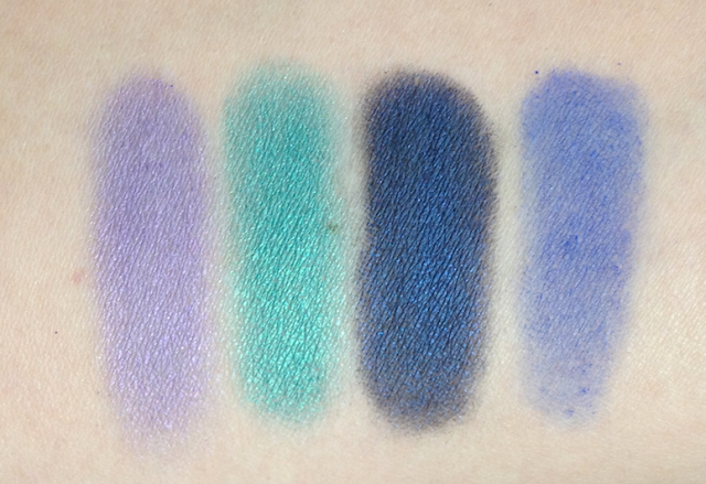
The violet shade is on the sheerer side, but builds up well, and has a soft, blendable texture. The green has richer colour and a similar texture. Both have a faint duochrome shimmer that gives them a nice glow when applied to the lid, and they pop beautifully when layered over a dark base. The navy shade is lovely - deeply pigmented and lightly shimmery. The texture is a bit powdery, so it does best over a base to maintain that richness. Otherwise it blends out really well as a crease shade.

The major disappointedment for me is the royal blue shade. It looks like Nars Outremer, and has the same issues of poor pigmentation, choppy blending incredibly patchy application. It's just a terrible shade, all the more so because the colour in the pan is so stunning.

Studio Secrets Pressed Eyeshadow Quad The Mystic's Gaze L'Oréal Project Runway Fall 2013 Collection


Colour Riche Lipstick in The Mystic's Kiss and Le Gloss in The Mystic's Shine: I love both of these!

L'Oréal Project Runway Fall 2013 Collection Colour Riche Lipstick in The Mystic's Kiss and Le Gloss in The Mystic's Shine

L'Oréal Project Runway Fall 2013 Collection Colour Riche Lipstick in The Mystic's Kiss and Le Gloss in The Mystic's ShineL'Oréal Project Runway Fall 2013 Collection Colour Riche Lipstick in The Mystic's Kiss and Le Gloss in The Mystic's Shine

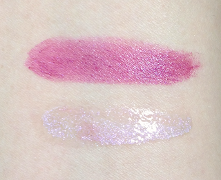
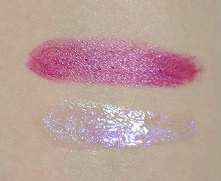
The lipstick is actually a lot more wearable that the bullet colour would suggest, more of a deep berry than purple. The texture is creamy and slightly hydrating, and it applies very smoothly.

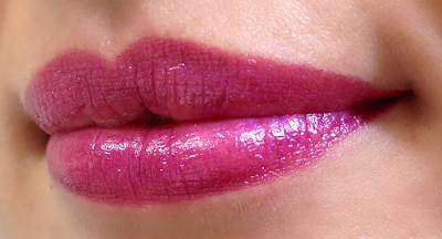
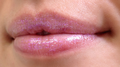
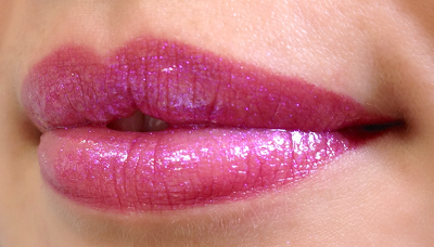
The lip gloss has a clear base with a ton of duochrome shimmer in violet-pink and lilac. In some lights it  reads as pink sparkle, in others it's almost blindingly holographic. The texture is thicker and stickier than I prefer, but as I like to wear it layered over the lipstick just at the centre of the lip, it's not a major issue.

L'Oréal Project Runway Fall 2013 Collection Colour Riche Lipstick in The Mystic's Kiss
Colour Riche Lipstick in The Mystic's Kiss

L'Oréal Project Runway Fall 2013 Collection Le Gloss in The Mystic's Shine
Colour Riche Le Gloss in The Mystic's Shine

L'Oréal Project Runway Fall 2013 Collection Colour Riche Lipstick in The Mystic's Kiss and Le Gloss in The Mystic's Shine
The Mystic's Shine layered over The Mystic's Kiss

Nail Color in The Tempress' Power: So. Freaking. Gorgeous. This is the "Get It, Get It Now" product from the collection.


This is definitely more of a layering colour, though if you're willing to do four coats like I did for the swatch, it's also beautiful worn as is. This polish is magical - tons and tons of fine duochrome shimmer in a sheer base. Shifting beautifully under the light, it's a mix of gold, peach, orange and chartreuse and even a bit of teal. I regret not getting a backup, because I suspect I will be wearing it layered over everything.


I'm not going to do the usual breakdown, as it's not readily available in Canada and prices vary wildly in the states, depending on region and drugstore chain you choose.

Is there anything you guys are eyeing or have already managed to get?

(I purchased all these items.)

September 21, 2013

Smashbox Always Sharp Waterproof Kohl Liner

If I have to choose between an automatic pencil liner and one that needs to be sharpened, I will usually go with the one that needs to be sharpened. The automatic one might be more convenient, but I prefer having a pencil that I can bring to a point.

But Smashbox has eliminated this game of "Would You Rather..." with their new Always Sharp Waterproof Kohl Liners.

Smashbox Always Sharp Waterproof Kohl Liner

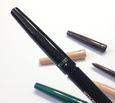
These innovative liners boast a "sharpener" built into the cap. As you screw the cap back on, the liner inside the casing pushes up a bit, while the tip is reshaped by the interior of the cap. When you take the cap off again the next time you use it, you have a precise point once again.

Smashbox Always Sharp Waterproof Kohl Liner

That sounds brilliant, doesn't it? And in many ways it is. It eliminates the mess and fuss of using a separate sharpener, and since it's not actually sharpening anything, you're not wasting any product that would otherwise be sliced off by the blade. It doesn't come to quite enough of a fine point to replace a gel or liquid liner, as the copy claims, but it's more than adequate for general eyelining needs.

It's also quite waterproof and budge-proof. Once it dries down - which it does in about 30 seconds, so move quickly if you need to smudge - it's quite resolved to stay exactly where you put it. On my notoriously demanding eyelids, it lasted 9 hours with only slight fading on the inner top lid.

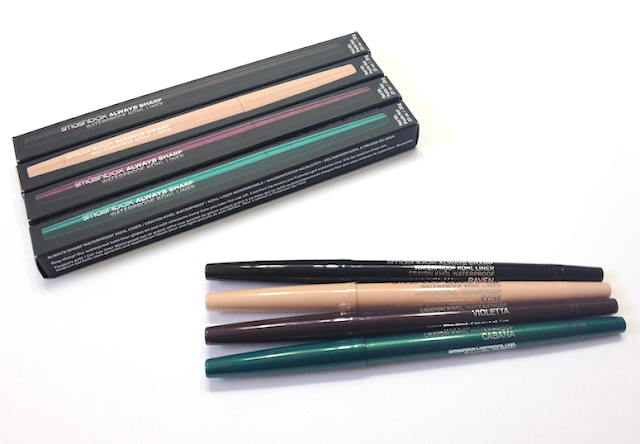
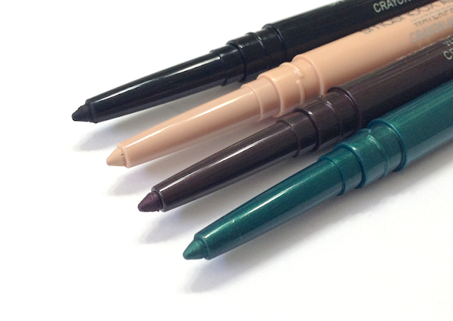
It also comes in a nice assortment of colours, from the basic black and nude to very vibrant teals, and the pigmentation is intense, and the application super smooth.

Smashbox Always Sharp Waterproof Kohl Liner
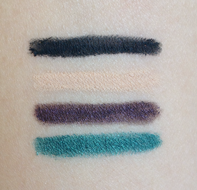
Top to bottom: Raven, Bare, Violetta, Cabana
Smashbox Always Sharp Waterproof Kohl Liner
Top to bottom: Raven, Bare, Violetta, Cabana
So what's the downside? Well, the thing that makes it work as well as it does is also what makes it impossible for me to use on my waterline. For a pencil to be remain soft enough to be molded into a point, it's likely to be too creamy to last when applied to the waterline. That's what I found to be true here, with barely an hour going by before the liner disappeared entirely. This was especially problematic with Bare, as I bought it for the sole purpose of lining the bottom waterline.

Their softness also makes lining the lower lashline a little difficult, as the tip can get caught up in the lashes and crumble around them, leaving a messy line behind. I had to take care to really get in under my lashes.

If you generally have good luck with liners staying in your waterline, you might get longer wear out of these than I did. In which case, you might unequivocally love them.

Availability: At Sephora stores and www.sephora.com, as well as certain Pharmaprix/SDM and Murale locations. Also at www.smashbox.com, which does ship to Canada. Price is 23$ CAD and 20$ USD.

Pros: Great shade range, self "sharpening", excellent pigmentation, generally budge-proof and waterproof.

Cons: Doesn't last in my waterline at all, but YMWV. Very soft texture can lead to crumbling during application when worked against the lashline.

(I purchased these items.)

September 20, 2013

Dior Mystic Metallics Collection Fall 2013 - Bonne Étoile Palette

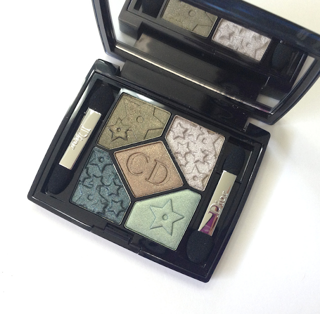
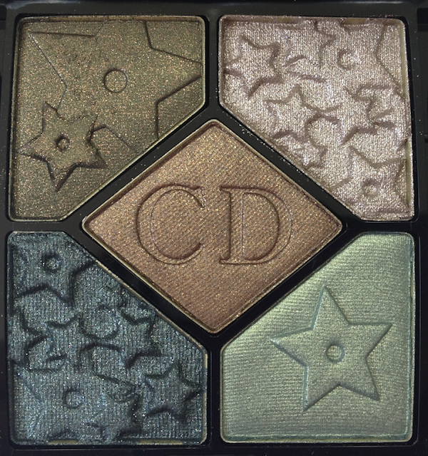
Some makeup items are so beautiful, they're almost magic. And like a lot of magic acts, these items can require a fair bit of backstage work to achieve that glorious on-stage effect. Such is the case with the Bonne Étoile Palette from the Dior Mystic Metallics Fall 2013 Collection, with its beautiful design and stunning colours.

Dior Mystic Metallics Collection Fall 2013 - Bonne Étoile Palette

If you know me, you know of my terrible, crushing weakness for all things Dior. When I saw the promo pictures for this collection, I drove my Dior counter SAs crazy with almost daily phone calls, and when I heard this palette was in stock, I literally raced over to the snag it (taking advantage of a Pharmaprix Optimum offer at the same time). I barely even bothered to test it in the store, which is, perhaps, why I was a little taken aback the first time I tried applying it.

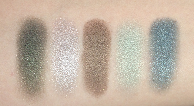
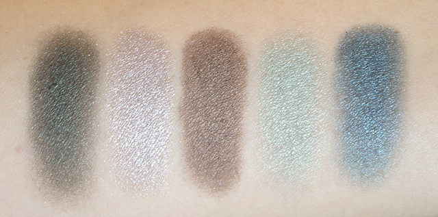
The color range is just gorgeous, Fall-like without being stereotypical, and they work together brilliantly. The shades all swatched nicely on my arm, with beautiful shimmer and sparkle. Getting that same intensity to show up on my eyes was a different story.


Dior Mystic Metallics Collection Fall 2013 - Bonne Étoile Palette

The smoky olive green in the top left corner has good pigmentation, and an absolutely gorgeous golden sparkle that for the most part falls away upon application. And while the payoff is good in terms of opacity, something about the olive undertones is lost, and it winds up looking almost muddy. It works well enough to smoke out the look or to add depth, but I've found using it wet is the best way to maintain that olive tone. The golden sparkle is better retained this way as well, and it creates an incredible, burnished metal eye look.

The pale silvered taupe in the top right corner has the most metallic finish, and sheer-to-medium pigmentation. This is probably the most magical shade out of the group - applied with a natural-bristle brush, it gives a faint fairy-like sparkle. Applied dry with a flat synthetic brush, it creates a lovely metallic look that is nice on its own, but that has enough sheerness to layer nicely over another shade. Applied wet, it has an intense foil-like finish that is super high-impact.

The bronze shade in the middle has a similar texture and finish to the olive green, with the same issues. It looks less muddy, however, and makes for a very nice crease shade. I had similarly much more vibrant results using it wet.

The seafoam green shade in the bottom right corner is the sheerest, with a slightly powdery finish. It can be built up over a primer or base, but the effect will remain whimsical and delicate. I had the best application using a flat synthetic brush over my usual MAC 239.

The pewter-teal shade in the bottom left corner has a stronger shimmer and smoother, denser texture than the bronze or the olive. It has the truest-to-pan result, and used wet it is off the charts gorgeous.

Overall, I find the textures of this palette to be more powdery and less dense and creamy than I'm used to from Dior, and the colour payoff to be both less vibrant and more sheer than I expected from the swatches. The powderiness makes it difficult to pick up and pack on colour, though it makes blending easier. Without a primer, fading was obvious 5-6 hours in (with a primer, a solid 9 hours before I saw any fading.)

However, using the right tools and the right mediums, the results could be absolutely stunning. Applied dry and using natural-hair brushes, the effect is softer and hazier - still pretty, but far less dramatic that the look of the promo images and the palette itself suggests.

Dior Mystic Metallics Collection Fall 2013 - Bonne Étoile Palette

Dior Mystic Metallics Collection Fall 2013 - Bonne Étoile Palette

Availability: Still out at some Pharmaprix/SDM locations. Price is 62$ CAD.

Pros: Lovely design, beautiful shade range that doesn't skew too warm. Amazing metallic and sparkle finishes that vary from delicate and fey to intensely dramatic depending on application tools and medium.

Cons: Powdery texture makes it difficult to get the same intensity as in the pan, and some of the glitter gets lost along the way. Wear doesn't make it through a workday without a primer.

(I purchased this item.)

September 19, 2013

Cover Girl Clean Whipped Creme Foundation in #320 Creamy Natural and Clean Glow Bronzer in #120 Spices

Is it me, or have drugstore foundations been getting better and better over the last few years? I remember buying my first high-end product (a Bobbi Brown foundation) specifically because I couldn't find a good shade match or reasonably decent texture at the drugstore. Granted, that was about 20 years ago, so most drugstore makeup has improved dramatically in the interim, but I've been taken aback by how many drugstore foundations in particular I've found to be just plainly excellent.

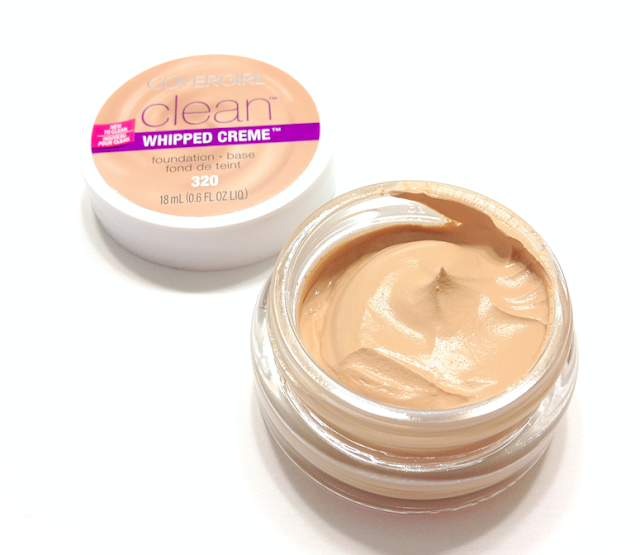
I'm happy to add the new Cover Girl Clean Whipped Creme Foundation to that list.

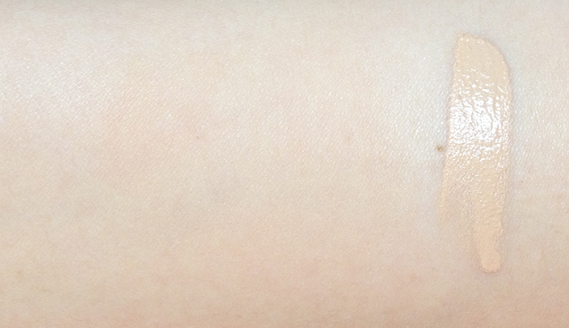
Cover Girl Clean Whipped Creme Foundation in #320 Creamy Natural
Clean Whipped Creme Foundation in #320 Creamy Natural
It has a "modern" matte texture; the finish is indeed matte, but looks like clean, perfected skin texture rather than dry or powdery. Although it has a cream consistency, it's also incredibly lightweight and airy, and blends into skin flawlessly, leaving no perceptible trace and no tangible sensation, only a smoother appearance. For those who don't enjoy the way foundation feels on their face, then this is a great option.

I found the formulation to be exceedingly sophisticated, very similar to the way in which the Giorgio Armani Maestro Foundation feels and interacts when applied. (And also similar to the equally budget-friendly L'Oréal Magic Nude Liquid Powder.) The difference being that it has that initially thicker, creamier consistency, which actually makes it easier to manipulate than a very liquid formulation.

The coverage is light to almost-medium with a second layer, but I would hesitate to build up too much past that point, as it does start looking more obvious and powdery. Like the two other foundations I've compared it to, I find it also does best on normal or slightly combination skin. If you have oiler skin, you'll notice some sheen after a few hours, like I did around my nose. I didn't find the foundation getting patchy, or emphasizing my pores, just looking dewier. A primer or mattifying powder would be enough to control that. For drier skin, you'll notice it will pick up on flakes and dry areas somewhat, though that effect does diminish substantially after an hour or so as the foundation settles. Minus the sheen aspect, the wear was great, lasting me 10 hours with no fading or breaking down.

As you can see, the shade number #320 matched me well, even though it was a randomly provided press sample.

As an aside, this foundation also has no discernible scent, which is a welcome change from previous Cover Girl foundations I've tried.

Cover Girl Clean Whipped Creme Foundation in #320 Creamy Natural
The foundation is blended out on the left, and swatched on the right.
I always enjoy a multi-tasking product, and the three shades available in the Cover Girl Clean Glow promise to do that by offering an ombré range of colours in each palette.

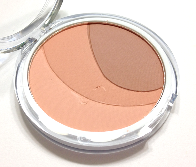
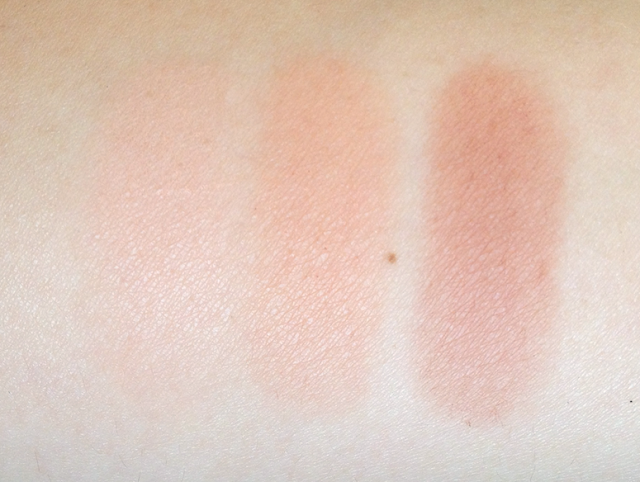
The one I have, in the shade #120 Spices, is specifically marketed as a bronzer as opposed to a blush. I think using it as such would largely depend on your skin tone. The shades range from a pale peach, a nectarine with a strong beige undertone, and a muted redwood. The two lighter shades actually make for a lovely peach blush that looks fresh and natural on my skintone, and would probably be especially flattering on a pale redhead.

The darkest shade is a bit too ruddy for me to wear as a blush, but works when applied to the high planes of my face to mimic the way my skin looks after I've caught some sun. I think for olive skin tones that look sallow in yellow-toned bronzers, this would work beautifully. It could also work as a contour if the traditional taupe makes you look like you have giant bruises instead of high cheekbones.

Cover Girl Clean Glow Bronzer in Spices
Clean Glow in #120 Spices
The packaging promises "lightweight, blendable matte colour", and I think that's accurate. The finish is matte, and the texture is silky-fine and firmly packed, dry and light without being chalky or powdery. It's also inherently quite sheer, though I was able to build up depth without it looking cakey on the skin due to that lightweight texture. (It's also what the model with the ponytail and burgundy eye look was wearing as a contour in this post.)

This is meant to create a natural look, blend in seamless and be relatively foolproof to apply, but if you prefer a dense, creamy texture and strong payoff, then this isn't for you. For deeper skin tones, it will probably be too light and sheer to have much effect.

It has no masking fragrance included, which actually results in a slightly odd smell if you sniff the pan directly, though it's not noticeable at all once applied.

Cover Girl Clean Glow Bronzer in Spices

Availability: Out in most drugstores now, including Jean Coutu and Pharmaprix/SDM. Also available on www.well.ca. Prices vary, though 8.99$ for each is the suggested price.

Pros: Both products have a very lightweight feel, and look natural and seamless on the skin. The foundation has a very sophisticated texture that looks like skin, only perfected, and it wears very well overall. The bronzer can be used as blush, bronzer and/or contour, depending on your skin tone.

Cons: Some shine and emphasis on flakiness with the foundation, depending on skin type. Unsuited for very oily or very dry skin. The bronzer is sheer, which makes it unsuited for darker skin or those who prefer more intensity.

(Disclosure: I am a #BeautyUnited blogger. As part of my affiliation with this group, I receive products and special access to P&G events. The opinions on this blog are my own.)

September 15, 2013

Beauty United Event in Toronto

I've been tremendously fortunate this past month, on both a personal and professional level. What do they call the opposite of Mercury Retrograde? Because that's what it feels like. This month has abounded in great opportunities and new relationships, and knowing how cyclical these things are, I'm cherishing and enjoying these moments.

One such opportunity was the Beauty United blogger event in Toronto this past month. I joined 30 other beauty bloggers from across Canada (including my beauty event bestie, Eugenia of Ommorphiabeautybar!) at the Trump hotel for the reveal of a new media program from Procter and Gamble. The goal was to introduce us to the beauty brands under that company's umbrella, while giving us the chance to speak with the makeup artists and hair stylists that represent those brands nationally and internationally.

It was a really fun evening, and getting to see the Fall trends explained by the very people who helped to develop them was a beauty junkie's dream. (Getting to meet fellow bloggers and eat scrumptious desserts was an incredible side benefit!)

The main conference room, where we shmoozed and gorged on daintily partook of chocolate and wine. You may recognize the lovely ladies behind Liner, Glitter, Gloss and Perilously Pale in the midst of this huddle. ;)


As you can see, I beelined straight for the chocolate.


Some of the products that were out on display for us to play with and discuss with the different representatives.

Blond is, of course, ALWAYS a trend.


Some of the newer items from Cover Girl, including the Flame Out line and the new Clean foundation.


An expansion of the very successful Regenerist line from Oil of Olay, as well their version of the CC cream.


I didn't even know that Vidal Sassoon had a haircare line in drugstores, until I spoke to the incredibly nice rep (who it turns out was an ex-pat West Islander - small world!).


The most exciting part for me, I'll admit, was seeing the presentations from Denis Binet and Amelie Ducharme, the artistic directors for hair and makeup, respectively, for Montreal Fashion Week.

Denis is charming in the way only a Parisian man can be, telling us stories of his daughters as he explained his inspiration for the Big Hair, Don't Care look. Amelie was no less delightful, joking that Pat McGrath always gets her best ideas from her. They were both very generous with their time and knowledge.

Denis Binet, the stunning model representing one of the Fall 2013 trends, and Amelie Ducharme.
Two of the looks presented:

1) Sleek, severe, almost androgynous hair. Contoured cheeks, burgundy-toned smoky eyes, modern matte skin.


2) Big hair, with a defined shape in the front and party in the back. Perfected but restrained eye and a saturated wine-red lip. Textures remain matte, but still wearable and fresh.


I also received a bagful of product to test out and review, so the first of those reviews will be coming this week. :)

(Disclosure: I am a #BeautyUnited blogger. As part of my affiliation with this group, I receive products and special access to P&G events. The opinions on this blog are my own.)

September 10, 2013

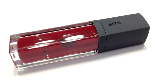
Bite Beauty Cashmere Lip Cream - Port

I love supporting Canadian-grown companies, especially indie brands. Bite Beauty is an easy one for me to love, as they generally do products with superior formulation and good-for-your-skin ingredients.

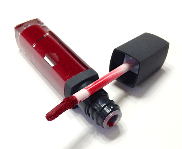
That said, I was a little taken aback when I opened up my box of the the Cashmere Lip Cream in the shade Port - the liquid inside appeared to be separating from the sides of the tube, and when I pulled out the wand applicator the consistency seemed oddly dried out. I was concerned that I had received a bad batch, and I attempted to contact the brand (by email and twitter) to see if the appearance of my item was unusual. I waited for about a week, but since I received no response, I'm going ahead with this review as is.

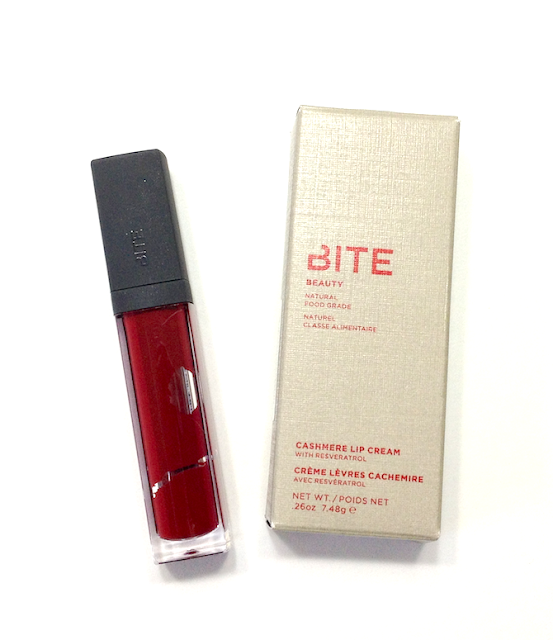
Bite Beauty Cashmere Lip Cream - Port

Bite Beauty Cashmere Lip Cream Port

Bite Beauty Cashmere Lip Cream Port

Aside from the issue stated above, I thought the packaging was both sleek and organic-feeling (at least insofar as the exterior packaging).

The Cashmere Lip Creams are supposed to have a much stronger pigment percentage - four times higher, in fact - and a creamy, buttery application that nevertheless becomes matte as the oils evaporate off.

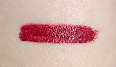
Without a doubt, these are extremely pigmented. My concern about the dried-out texture of the wand was unfounded, as what was on it applied both smoothly, and with faultless payoff.

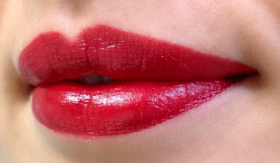
Despite the intense pigmentation, this didn't looked thick or like it was sitting on top of my lips, and it didn't bleed or collect in the lines of my lips. It felt comfortable on, though not quite the feather-light texture that the copy promises. I could definitely feel that I was wearing something.

The oils and butters are supposed to evaporate at different rates, creating that smooth application and eventual matte finish. It actually stayed looking creamy longer than I expected, and though it dried down, it stayed flexible and didn't turn crackly or parched. When I pressed my lips together I could still feel a touch of creaminess and after about 3 hours, and it didn't make it through my lunch the way long-wearing, truly matte finishes can. I actually don't mind that, as it overall felt a lot easier on the lips than that sort of finish.

I also really liked that I got lipstick level coverage, with the precision of a wand applicator. For a vibrant shade like this, it's a real time-saver to not need a lipliner or lip brush.

Speaking of colour, isn't it gorgeous?? Again, the copy states that this is a deep wine, but once on my lips it was more of a slightly blue-leaned medium-to-deep red. Rich and elegant, but not as dark as I expected. It's the near-perfect red shade for me, making my teeth white and my complexion brighter.

It has a very faint, naturally fruity fragrance that I find pleasant.

Bite Beauty Cashmere Lip Cream Port

Bite Beauty Cashmere Lip Cream Port

Availability: Exclusive to Sephora, for now. Price is 32$ CAD.

Pros: Incredible pigmentation, smooth and creamy texture, comfortable wear. Precise application with the wand, eliminating need for lipliner. No bleeding.

Cons: Average wear-length and general tenacity, whereas I expected more due to the state matte finish. And though this is not a reflection on the product as such, communication with the brand was non-existent, which I find a little off-putting when a brand uses social media and advertises a customer service email.

(I purchased this item from Sephora. This post is not sponsored or compensated.)
September 05, 2013

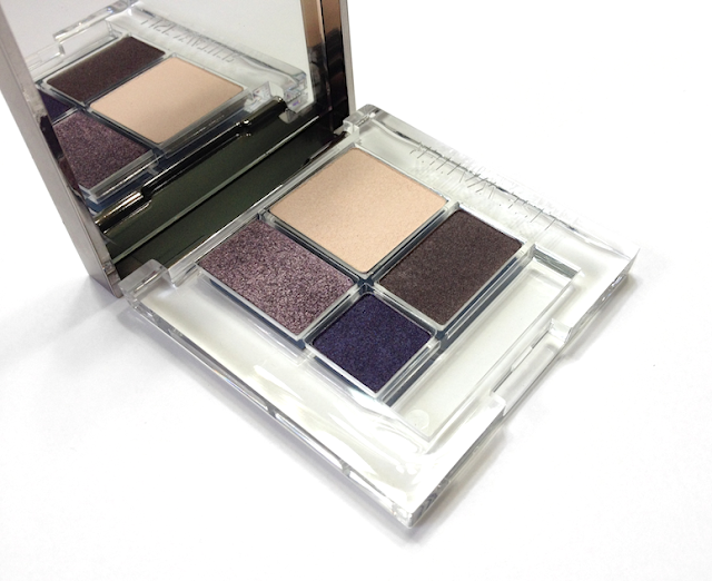
Lise Watier tartantastique Fall 2013 Collection - Quatuor Eyeshadow Quartet in Les Mauves

The Tartantastique Fall Collection from Lise Watier features a limited edition palette, but also introduced a new permanent palette to the current line-up of Quatuor Eyeshadow Quartets: Les Mauves.

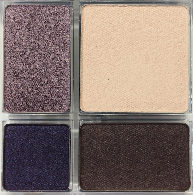
I find the name a little puzzling, as the shades call to mind fields of heather and lilac trees rather than anything resembling mauve. It's an absolutely gorgeous palette of cream, blue-leaning violet, icy lilac and cool, bittersweet chocolate. Beautiful shades that call to mind dusk and the darkening days of autumn.

Lise Watier tartantastique Fall 2013 Collection - Quatuor Eyeshadow Quartet in Les Mauves

Lise Watier tartantastique Fall 2013 Collection - Quatuor Eyeshadow Quartet in Les Mauves

All the shades in this palette have an intensely creamy texture. When you rub your finger over them, there is absolutely no powder kick-back, and they feel totally luxurious. They have beautiful pigmentation, and apply and blend like a dream. I especially appreciate the texture of the cream shade, as it can be difficult to find a white or cream that doesn't go a bit powdery or chalky, unless it's also a frost.

The cream and brown have a relatively matte finish, but due to that lovely texture they look anything but flat when applied.

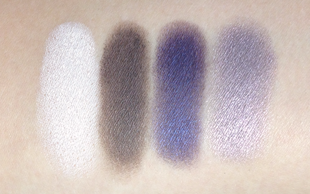
The blue-violet shade is perhaps the sheerest of the bunch, but that's only if you want to be picky. It has a soft, duochrome-y shimmer.

The lilac is the most shimmery - almost metallic, actually - of the four and reads warmer or cooler depending on the way the light hits it. If you're looking for a nice alternative to the usual mauve-taupe shimmer (AKA Satin Taupe and all her clones), this is a great option.

I love the inclusion of that cool-toned brown, which can work as a liner, to deepen the crease and to generally wear the violet shades in a more neutral fashion.

The wear time on these was good - 10 hours easy over primer, no creasing or fading.

Lise Watier tartantastique Fall 2013 Collection - Quatuor Eyeshadow Quartet in Les Mauves
Left to right: Swatched clockwise from top right corner of the palette.
I thought this palette might be similar to the Les Vins palette I reviewed previously, but overall it is cooler, with a broader range of finishes, and with a creamier, more pigmented texture. Colour-wise, I found the closest similarity to be between the blue-violet in this palette and the indigo blue in the Les Vins palette, which is swatched below for comparison.

Violet from Les Mauves on the left, indigo from Les Vins on the right.

Availability: At Lise Watier counters at Pharmparix/SDM, Jean Coutu, The Bay (including www.thebay.com), as well as from www.lisewatier.com. Price is 32$ CAD/USD.

Pros: Intensely creamy texture, excellent payoff, superior blendability and great wear. Nice balance of textures, and more vivid and neutral shades.

Cons: Aside from it being more cool-toned and perhaps a bit more difficult to wear on very warm complexions, I can't think of one.

(This item was provided by the brand/PR to be considered for review. This post is not sponsored or compensated.)
September 03, 2013

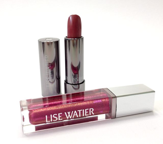
Lise Watier Tartantastique Fall 2013 Collection - Haute Lumière Lip Gloss in Spotlight and Rouge Sublime Lipstick in Tartan

A berry-toned lip is a classic for Fall, and Lise Watier offers up a couple of interesting variations on this theme with two of the lip products in their Tartantastique Collection.

The Haute Lumière High Shine Lip Gloss in the shade Spotlight, and the Rouge Sublime Lipstick in the shade Tartan are both new additions to their respective product categories, debuting with this collection but not limited edition.

Lise Watier Tartantastique Fall 2013 Collection Haute Lumière Lip Gloss in Spotlight and Rouge Sublime Lipstick in Tartan

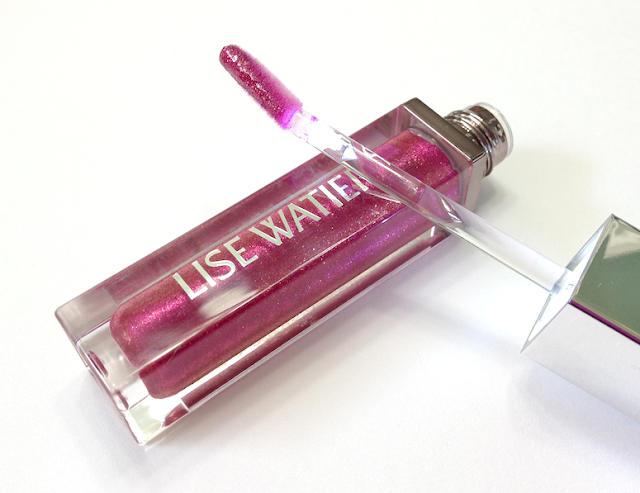
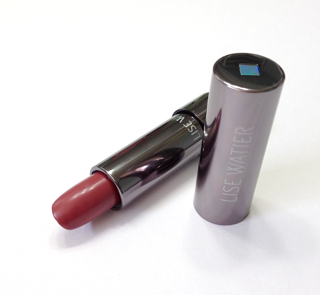
The packaging is sleek and elegant, as per the rest of the Lise Watier brand, with nice metallic casing. I really like the squared-off tubes for the lip gloss.

A particular feature of the Haute Lumière Lip Gloss is that it actually comes equipped with a light in the cap that is automatically activated when you twist it open. A little gimmicky, but surprisingly useful if you ever have to touch up your gloss at night, especially in a car.

And how gorgeous is that sparkle in the lip gloss tube??? It looks like a duochrome nail polish. LOVE IT.

Lise Watier Tartantastique Fall 2013 Collection Haute Lumière Lip Gloss in Spotlight

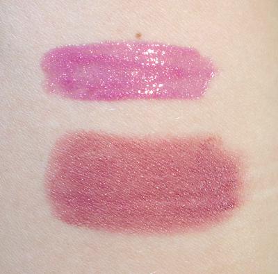
Spotlight is a medium textured gloss, neither thick not overly thin, and it doesn't feel sticky on the lips. It has a relatively sheer base of violet-tinged mauve that looks more pink on my lips, and a golden shimmer throughout that looks subtle at first but becomes more apparent as the base colour settles on the lip.

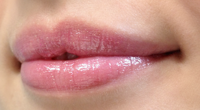
It's a pretty gloss by itself, though less vibrant than it appears in the tube, but it's especially lovely when applied over a berry lipstick that amplifies the shade and allows the shimmer/sparkle to become more apparent. It wears about 2-3 hours on me before starting to fade down, though the sparkle hangs around longer and it does leave a faint stain behind.

I'm not as crazy about the wand applicator, which feels just a trifle too long and drags some of the product off as you swipe. Not a deal-breaker by any means, though. The scent is sweet and fruity, a little stronger than that of the lipstick.

Lise Watier Tartantastique Fall 2013 Collection Rouge Sublime Lipstick in Tartan

Tartan is a Rouge Sublime Lipstick, which are supposed to soften and hydrate your lips as you wear it. It definitely has an emolliant feel, and a medium level of pigmentation. It's glossy and lush on the lips, and does hydrate and make them more full-looking as a result.

This shade swatches with a bit of a warm undertone, but on my lips it's a soft, mauve-y berry shade. Very fall-appropriate, without being vampy. This is the kind of shade that just looks pretty and elegant no matter the social situation.

It lasts about 4 hours on average, and has a pleasant, faintly sweet/fruity scent.

Lise Watier Tartantastique Fall 2013 Collection - Haute Lumière Lip Gloss in Spotlight and Rouge Sublime Lipstick in Tartan
Top to bottom: Spotlight and Tartan

Lise Watier Tartantastique Fall 2013 Collection Haute Lumière Lip Gloss in Spotlight
Haute Lumiere High Shine Lip Gloss in Spotlight

Lise Watier Tartantastique Fall 2013 Collection Rouge Sublime Lipstick in Tartan
Rouge Sublime Lipstick in Tartan

Availability: At Lise Watier counters at The Bay and most Pharmaprix/SDM locations, as well as Jean Coutu. Also at www.lisewatier.com, which does ship to the US as well.  Price is 21$ CAD/USD for the lipstick and 22$ CAD/USD for the lip gloss.

Pros: Lipstick is hydrating and softening, very pleasant to wear, and the shade is passe-partout - appropriate for work or play. The lipgloss is surprisingly soft and pretty on its own, with a sparklier, more dynamic finish layered over a lipstick. It's a medium-weight, non tacky formula. The light feature is fun and functional.

Cons: The amazing colour visible in the lip gloss tube doesn't translate to the lip due to the product's sheerness. The applicator is a little too long for my personal liking, but YMMV.

(These items were provided by the brand/PR to be considered for review. This post is not sponsored or compensated.)